
RX Library - Interactive Marketing Website
The public face of the RX Library telehealth platform: a scroll-driven story that explains a complex infrastructure product to enterprise buyers, led by a single 3D object that follows the visitor down the page.
Role
Design & Development
Stack
Next.js, Three.js, Tailwind
Deploy
Vercel
Scope
11 hand-tuned sections
1. Overview
A product page that behaves like the product: precise, layered and alive. RX Library is the multi-tenant telehealth platform described in its own case study. This is its website, and I designed and built every part of it, from the visual language to each animation, with very fine control section by section.
It is a standalone Next.js app that deploys as a static marketing page: no backend, no internal packages. Around 3,900 lines of TypeScript carry eleven sections, two Three.js scenes and all of their motion.
⚠️ The Challenge
The audience is not a patient any more. It is an organization deciding whether to build on a healthcare distribution platform, and the product is infrastructure, which is hard to show.
- Abstract product: rules, integrations and data models have no natural picture
- Many audiences: employers, providers, pharmacies and brands each need to see themselves in it
- Trust: a regulated space punishes anything that looks improvised
✓ The Solution
Make the abstract tangible, one section at a time. A 3D cube gives the platform a body and travels with the visitor. Each section then proves one claim with something you can watch or touch: a diagram of nodes, a carousel of brands, an order that moves itself through its lifecycle, live product screens that switch by role.
2. Design Language
Neumorphism: Paired dark and white offset shadows give cards and buttons a soft, physical depth, and the whole site uses them consistently.
Palette: Near-black surfaces, a light grey field and a single warm yellow accent, with a few status colours reserved for meaning.
Type: A system font stack with tight tracking, 800-weight display headlines and fluid sizes that scale with the viewport.
Data-driven sections: Arrays of brands, steps, roles, personas, cards and testimonials feed the sections, so copy changes never touch layout.
3. One Cube for the Whole Page
A single fixed Three.js canvas shows a 3×3×3 cube whose 27 pieces are rounded extruded boxes with glowing stickers, lit by an amber point light and a few fills. A scroll-threshold state machine moves it between key positions (hero, orbital section, white label, off-screen) and interpolates the camera, position, scale and light every frame. Positions are recomputed from the viewport on resize, the pixel ratio is capped, and the renderer is disposed on unmount. Using one canvas for the whole page means one WebGL context instead of one per section.
4. Section by Section
Every section below was tuned on its own. Here is what each one does and what went into it.
Hero
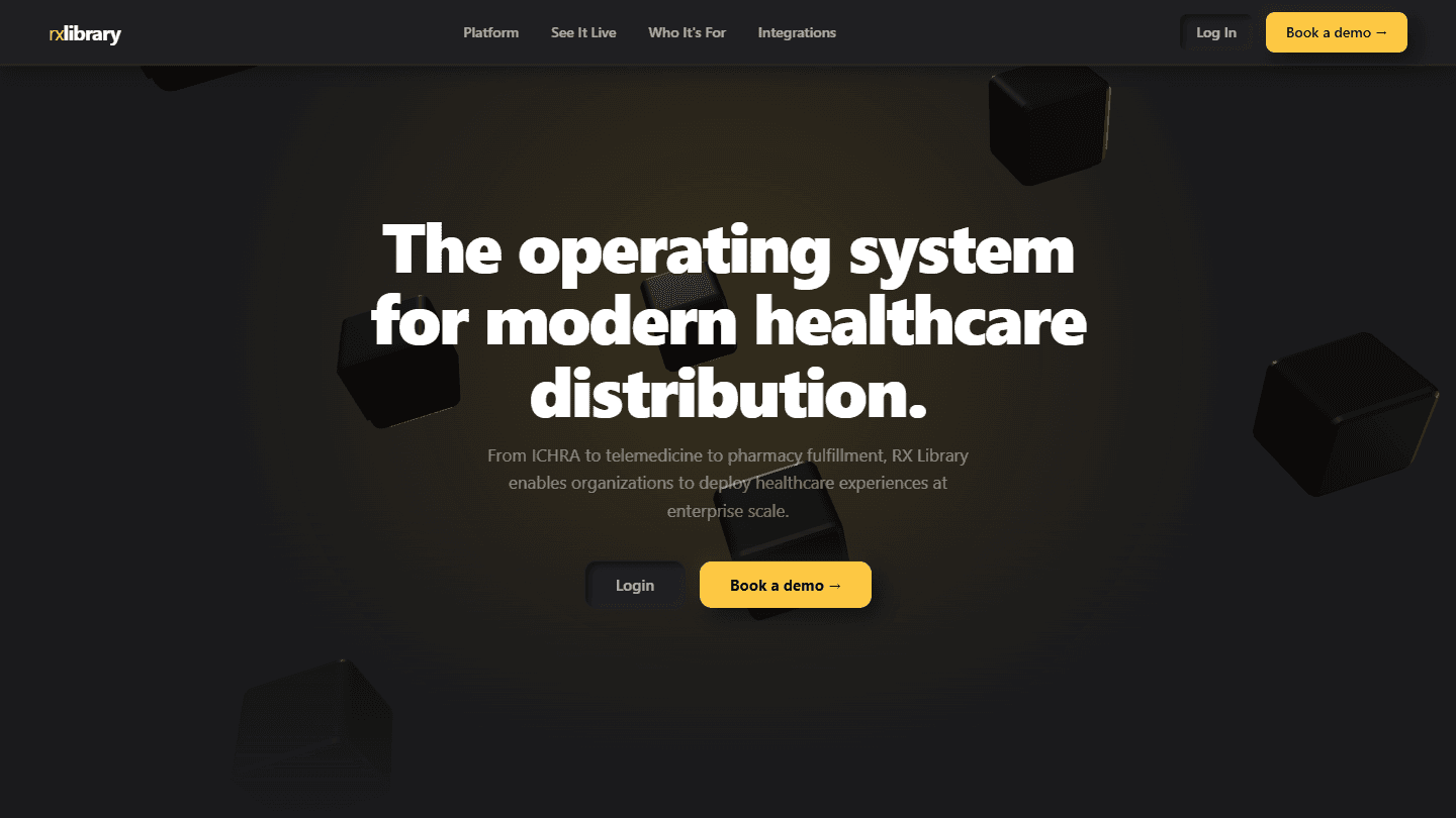
A full-height dark stage with a radial amber glow and one sentence: the operating system for modern healthcare distribution. The headline, sub-copy and the two calls to action fade in on a staggered timeline with a custom easing, type scales fluidly between 34 and 68 px, and the cube starts as a frozen explosion of pieces scattered radially that drift into place.

Trust strip
A quiet row of compliance and coverage badges with custom inline SVG icons at low opacity and a tracked uppercase label, revealed with an IntersectionObserver-driven rise so it never competes with the hero.

Platform architecture
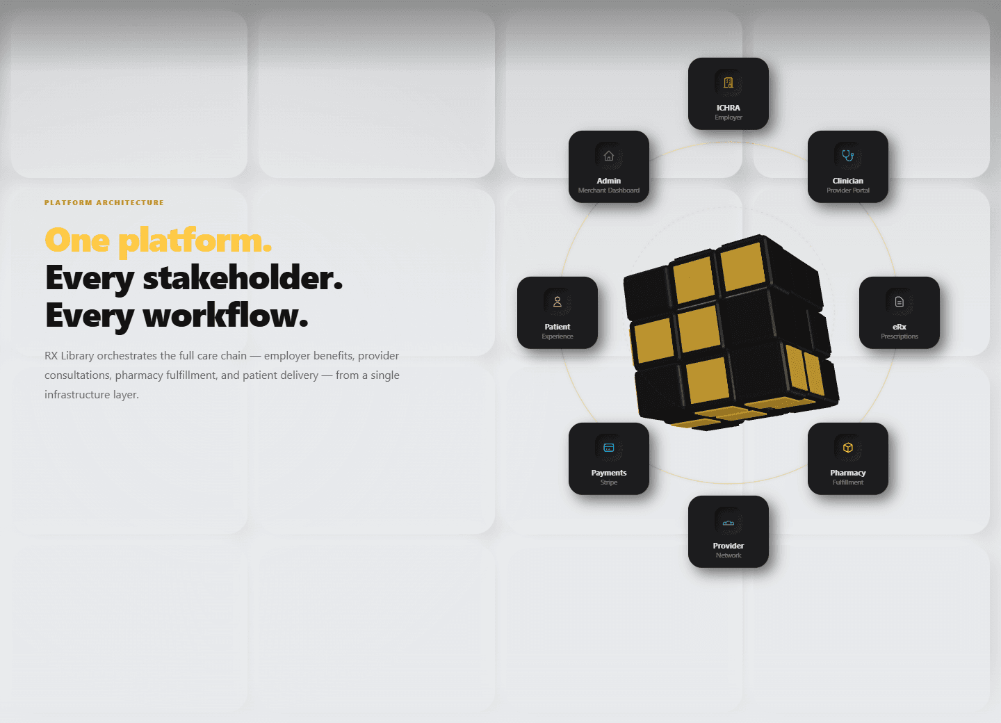
The first big idea: one platform for every stakeholder. A tall gradient bridges from the dark hero into a light field, and eight orbital nodes (ICHRA, clinician, e-prescribing, pharmacy, provider network, payments, patient and admin) sit on SVG rings with glow filters, each as a neumorphic card with its own accent colour and a staggered entrance. The 3D cube sits at the centre and performs random 90-degree face-slice turns: nine slices around a pivot group that snap back into place.
White label
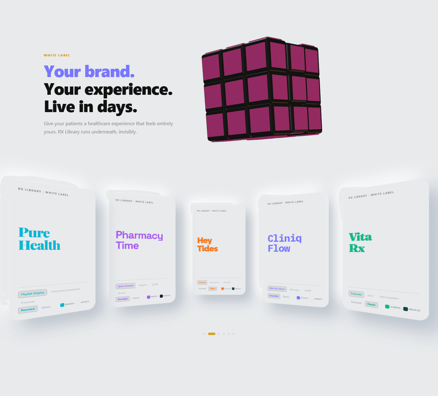
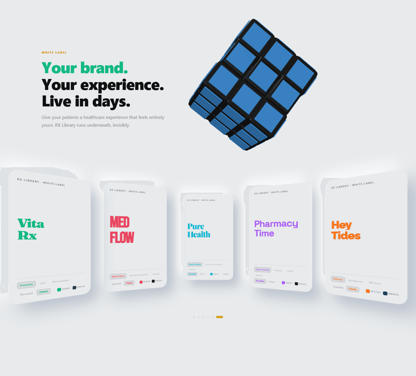
"Your brand." cycles through a six-colour palette on a ten-second loop, in step with the cube's own colour cycle. Below it, an elliptic 3D carousel presents six fictional brands, computing a translate, rotation, depth and scale for every position and entering from the right direction. Each card previews its own font pairing and colour chips, using sixteen imported Google fonts, with a three-second autoplay and pagination pills.
Care network
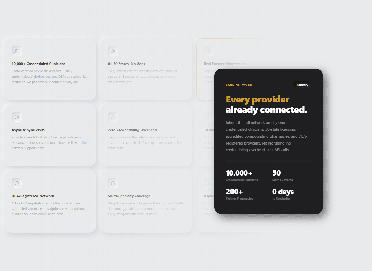
A deliberately asymmetric layout: a two-column grid where the right column is an 800 px dark card, and behind it a six-by-three field of eighteen bento cards fades out through a gradient mask. Three cards at a time flash an energy stroke, applied straight to the DOM classes so nothing re-renders, and the four headline figures count up one after another with a requestAnimationFrame counter and cubic easing, triggered when the section is 40% visible.
End-to-end automation
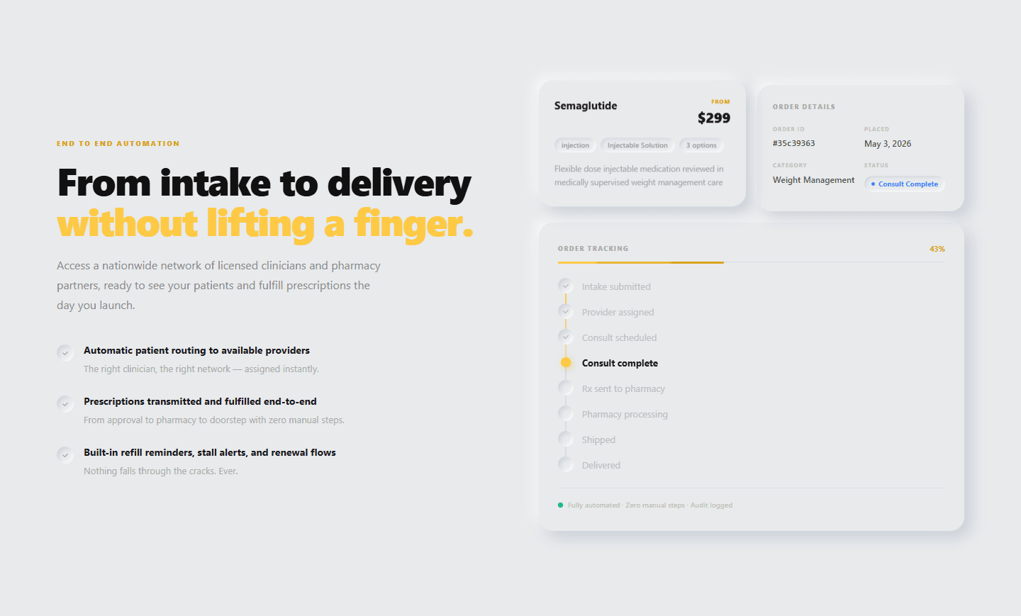
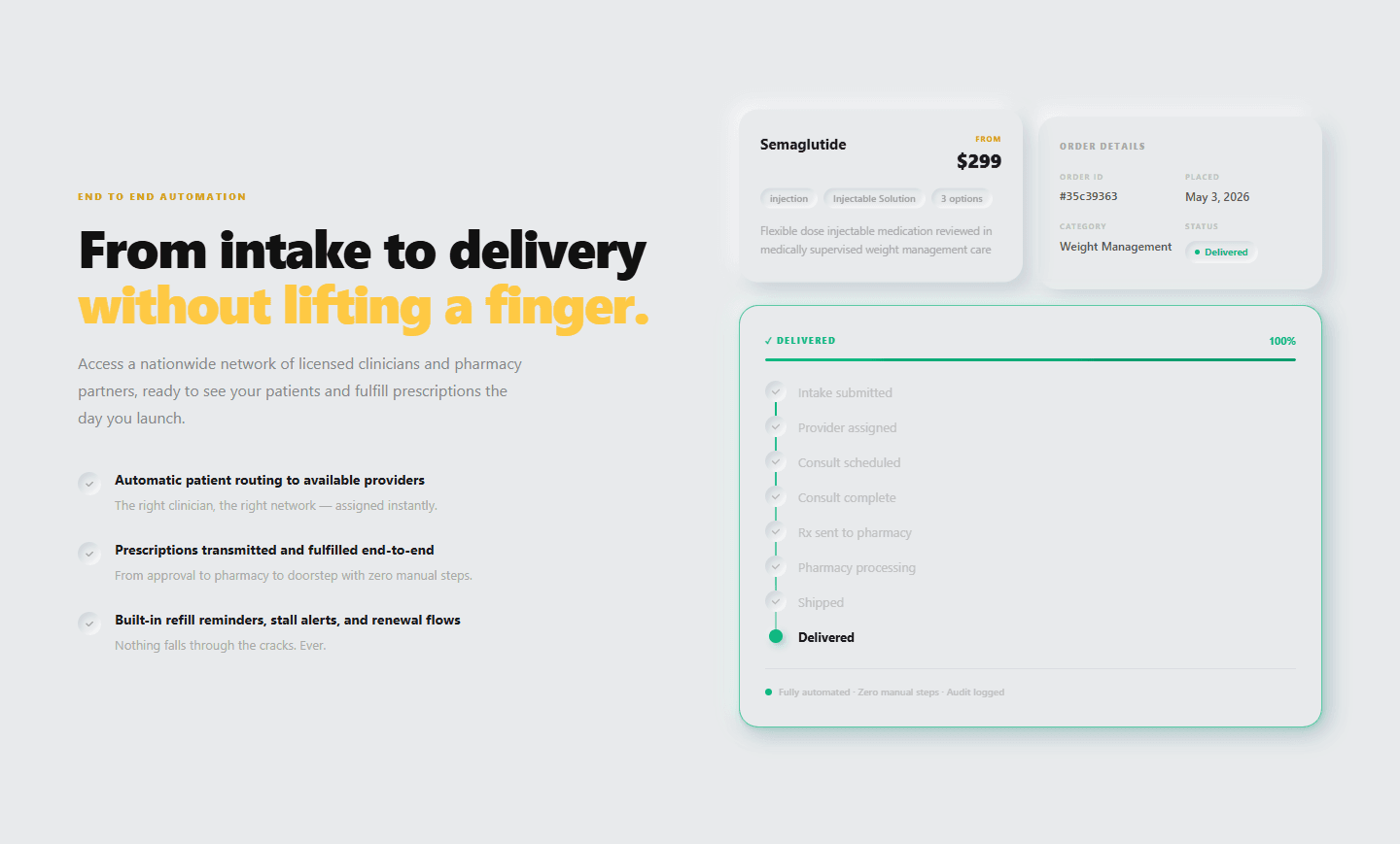
An order tracker that runs itself: an eight-step card from intake to delivery advances every two and a half seconds, holds on the final state, and shows a progress percentage, a status pill, a cascade of dots and a pop with a green pulse when the order is complete. A floating product card hovers beside it on a slow vertical loop.
See it in action
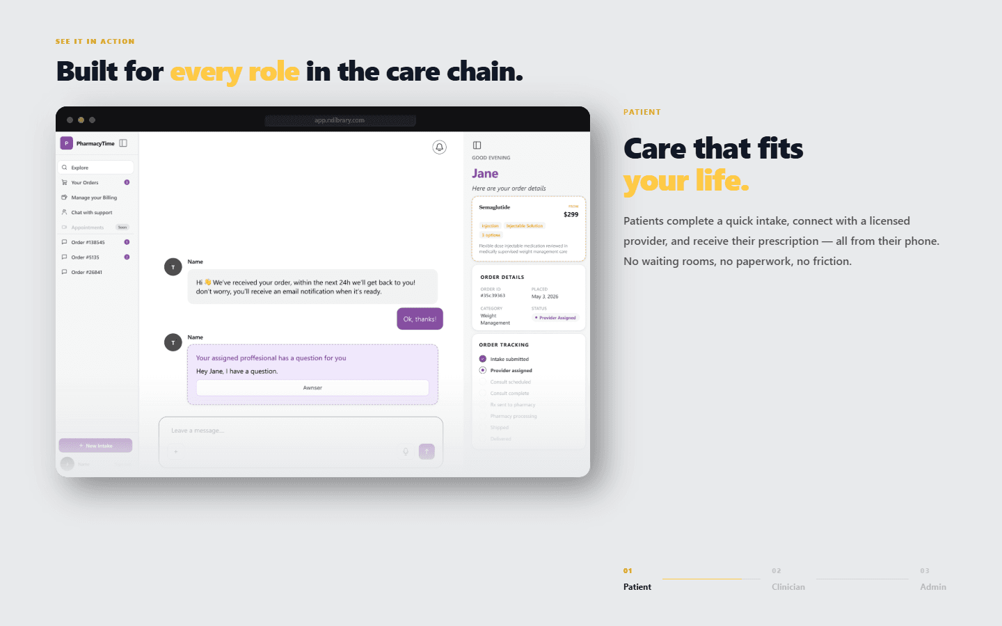
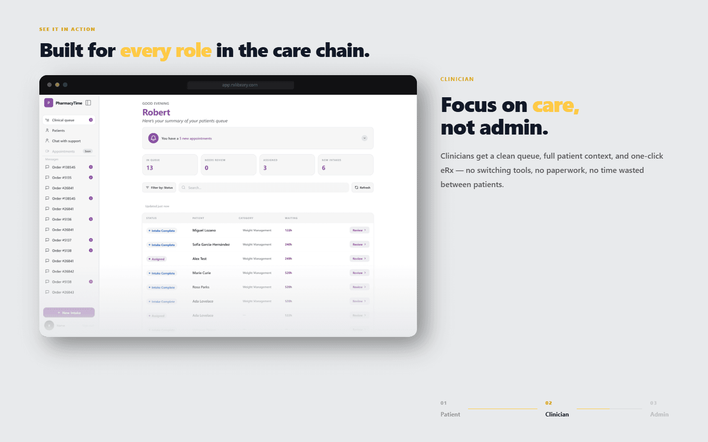
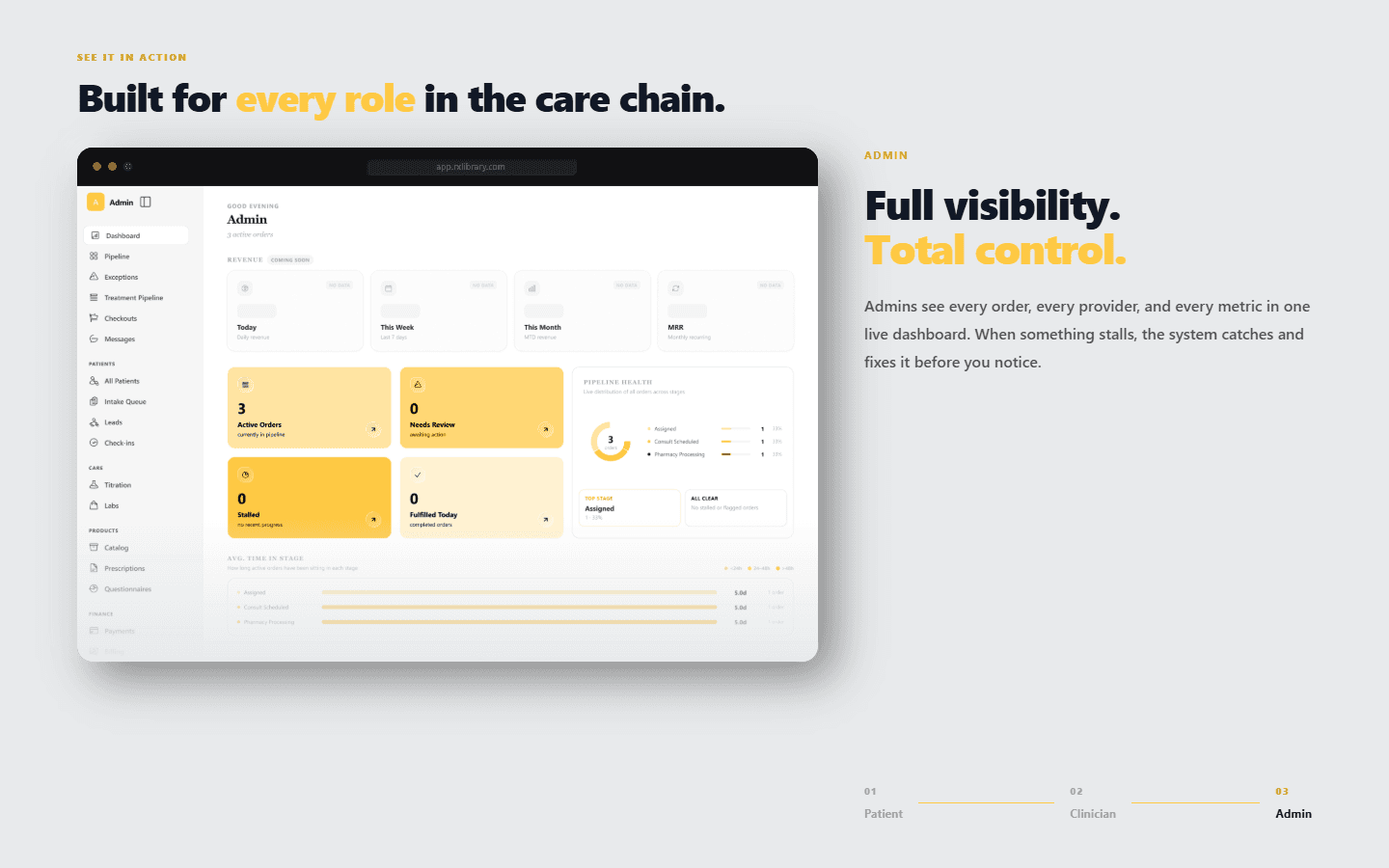
The centrepiece is a 320vh scroll track with a sticky full-height stage. Scroll progress, computed from the section's bounding box, drives a browser-chrome card that tilts in (a 20-degree rotation flattening while it scales up over the first fifth), then switches role at one third and two thirds: patient, clinician, admin. Three real product screens crossfade through next/image, the copy remounts with its own entrance, and a segmented indicator tracks the three roles.
From stall to resolved
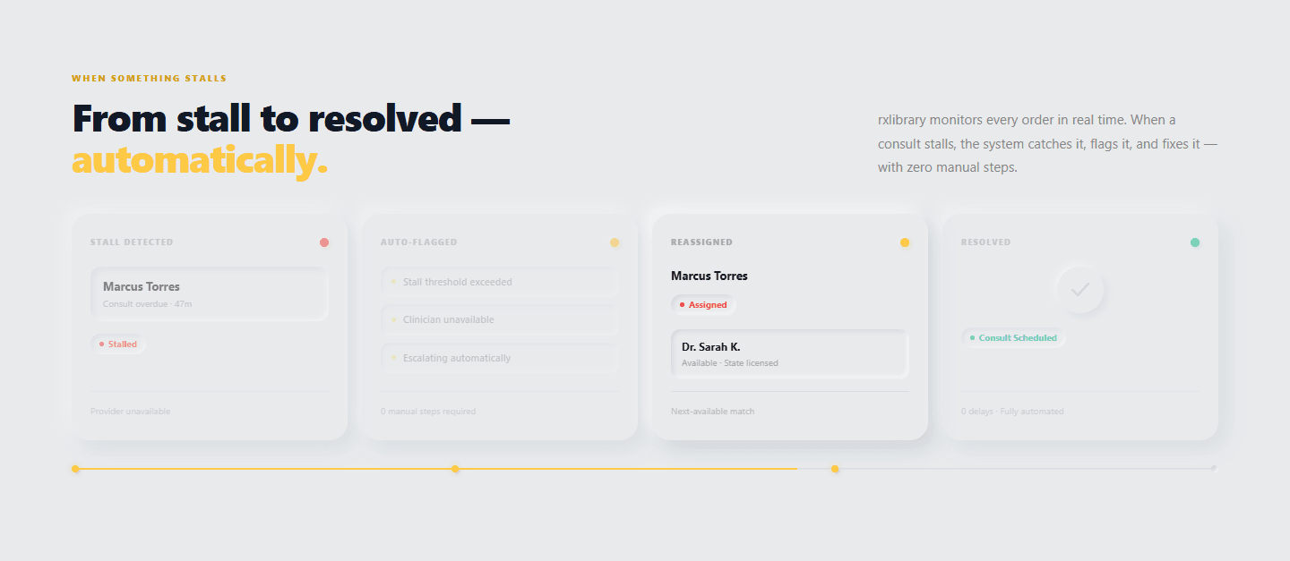
Directly below the sticky stage, four story cards (stall detected, auto-flagged, reassigned, resolved) turn a boring exception into a narrative, with red, yellow and green status dots, a highlighted active card and a progress line with nodes.
Built for your world
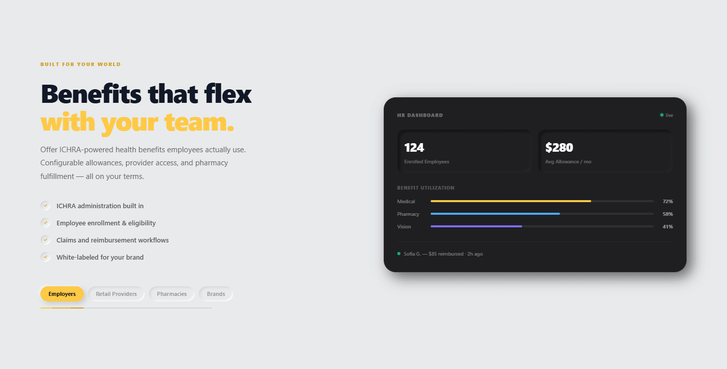
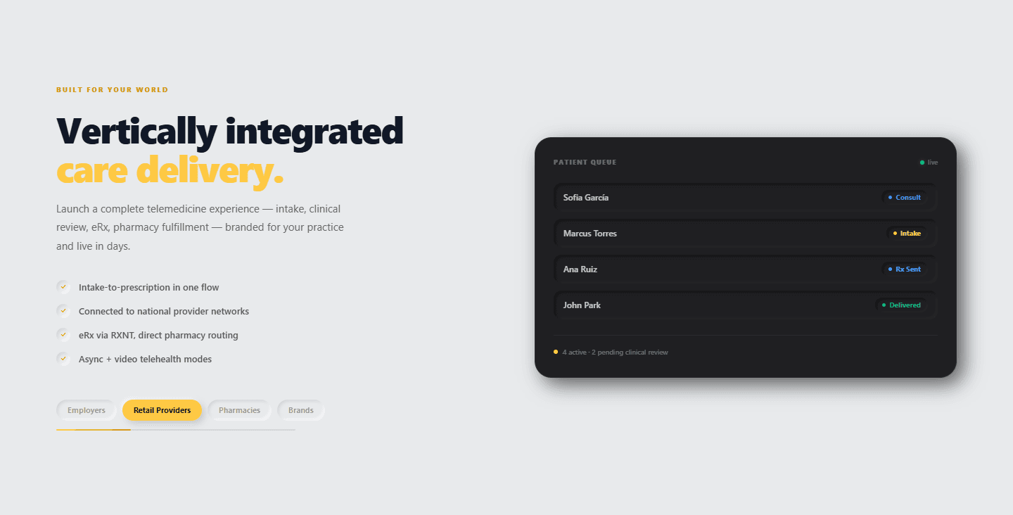
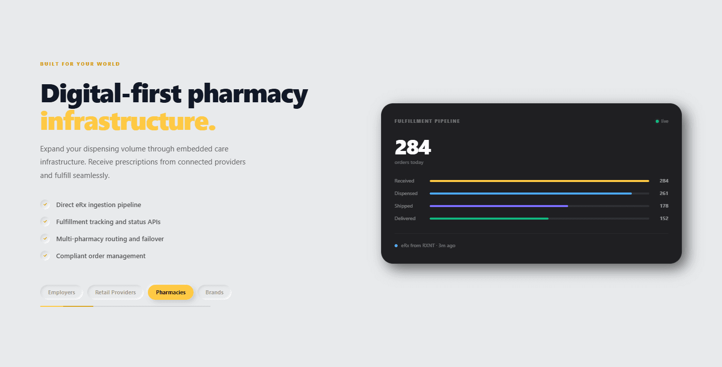
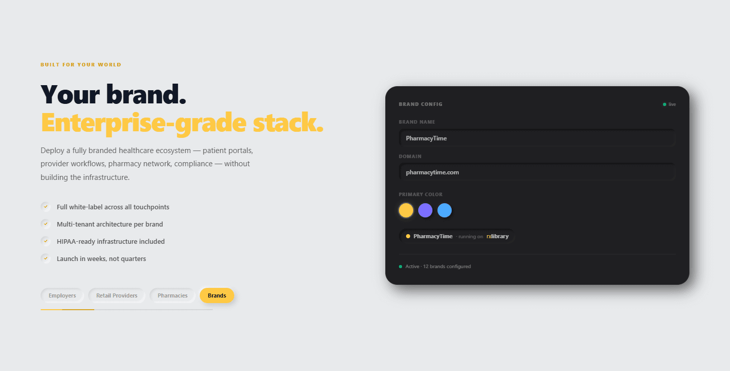
One section that morphs for four audiences: employers, retail providers, pharmacies and brands. It auto-cycles every five seconds with a progress bar, pauses on hover, and lets you switch manually, re-entering with staggered bullets. The headline changes with the persona, and so does a dark UI card: an HR dashboard with utilization bars, a patient queue, a fulfillment pipeline and a brand configurator.
The network speaks
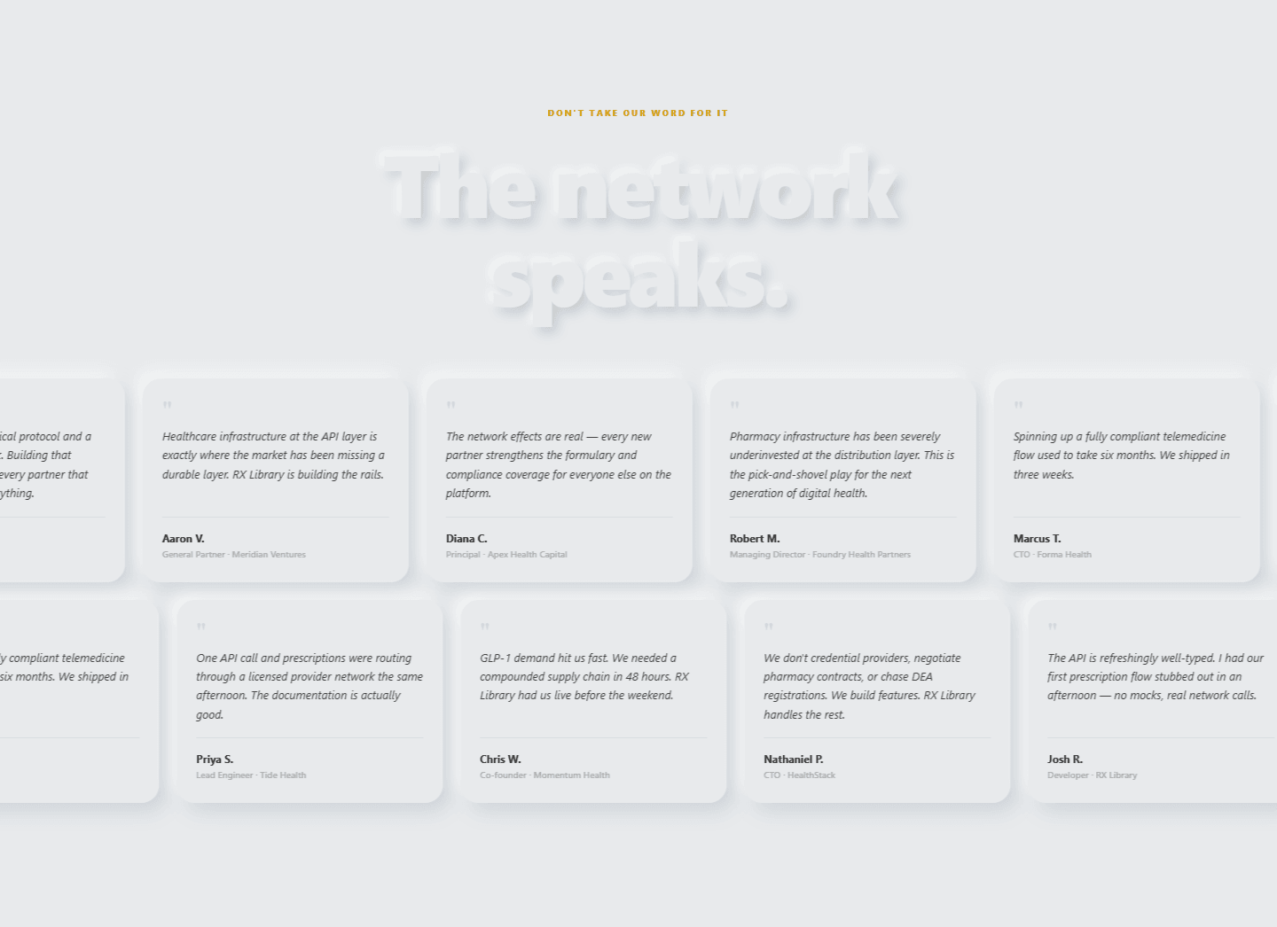
Social proof as motion: two full-bleed marquee rows of fourteen quotes, in cards offset from each other and scrolling in opposite directions at different speeds, accelerated on the compositor with will-change and paused on hover. The headline is embossed with a text shadow on the light field.
Call to action and footer
The page closes on a dark two-column call to action beside a second, self-contained Three.js scene: a levitating cube with a slow rotation and a glow pulse. Its render loop pauses through an IntersectionObserver whenever it is off-screen.

5. Technical Decisions
One canvas, a state machine
A single fixed canvas driven by scroll thresholds avoids a WebGL context per section, and interpolating toward each key position keeps the motion smooth whatever the scroll speed.
Bypass React where it would hurt
The random energy blinks toggle CSS classes directly on the DOM and the counters run on requestAnimationFrame, so continuous animation never triggers a re-render.
Pause what you cannot see
The footer scene stops rendering off-screen, the carousel and the persona cycle pause on hover, and the heavy 3D component is loaded on the client only.
Static deployment
The site has no backend, deploys to Vercel and updates on every push. It is extracted from the main application and stays in sync with it.
6. How It Evolved
The history shows how fine-grained the work was. After the standalone extraction, a visual overhaul introduced the neumorphic language, a key position for the cube and the font carousel. The care-network dark card, button hover effects, the footer cube and the sequential stat animations followed, and a final redesign added the testimonials carousel and section theming. In this repository the page roughly doubled in size in three days, from about 1,400 to 2,900 lines.
11
sections
2
Three.js scenes
27
cube pieces
14
testimonials
3.9k
lines of TypeScript
Key Takeaways
- Give the abstract a body: A single recurring 3D object made an infrastructure product feel like one thing.
- One claim per section: Each section proves exactly one idea with something the visitor can watch or touch.
- Performance is part of the design: One canvas, direct DOM updates and paused loops kept a very animated page light.