Take AWAY
A food delivery app developed to meet the needs of both clients and restaurants combining beauty and simplicity.
My Role
UX/UI Design
Duration
5 Weeks
Tools
Figma + Jira
Type
MVP / Agile
Project Overview
During 5 weeks, a multidisciplinary team and I joined strengths to develop an MVP for a food delivery app. Using Agile methodologies, we came up with Take Away as a solution for Restaurants and Clients to connect.
The Task: Develop a functional app that meets the user stories within the strict timeline.
The Client: No-country is a non-profit organization meant to guide IT professionals into the best industry practices while connecting their projects with potential clients. They took the role of stakeholders, assigned us a Team Leader, and evaluated our work at a final committee.
My Process
The Research
During this phase, I conducted market audits with a clear focus on defining the project’s scope and identifying industry best practices. By analyzing competitors and trends, I gained insights that helped shape a strategic foundation for our product. This research-driven approach ensured that our design decisions were informed, user-centered, and aligned with real market demands.
I gathered data, developed user personas, and benchmarked key features that aligned with our goal: creating an MVP that effectively met our users' needs.
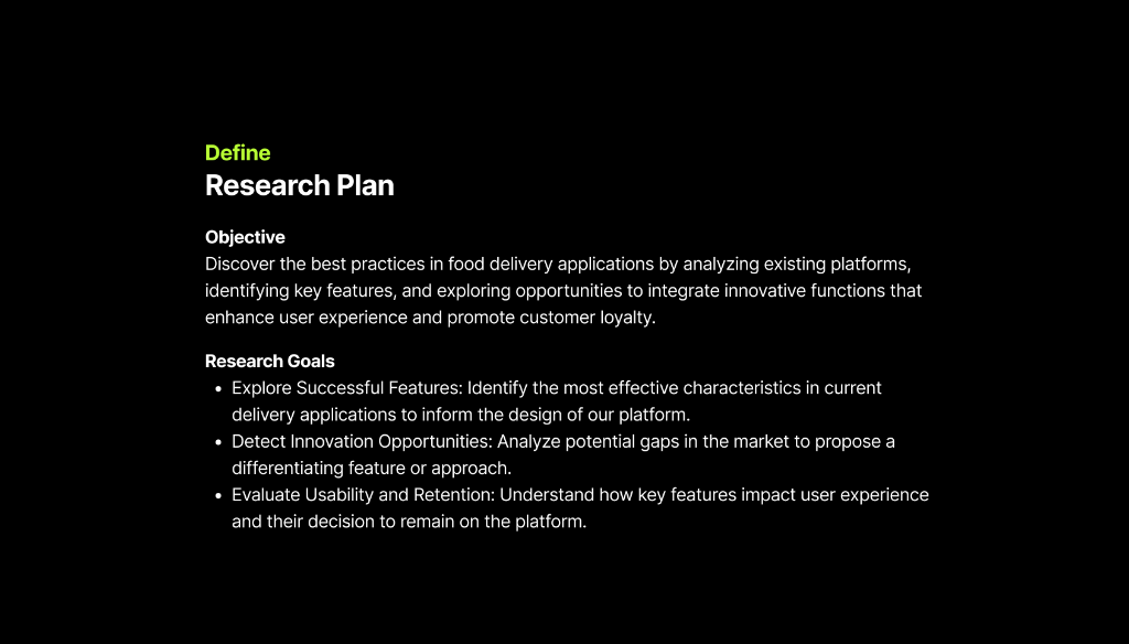
1. Research Plan & Objectives
Definition and Research Plan. The project began with a strategic definition phase to establish a solid knowledge base. The main objective was to discover best practices in food delivery applications by analyzing existing platforms, identifying key functions, and exploring opportunities to integrate innovative features that improve the user experience and foster loyalty.
🎯 Research Goals
- Explore successful features: Identify the most effective features in current applications to inform the design of our platform.
- Identifying innovation opportunities: Analyzing potential gaps in the market to propose a differentiating approach.
- Evaluate usability and retention: Understand how key features impact the user experience and their decision to remain on the platform.
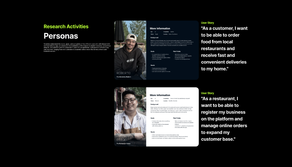
2. User Personas & User Stories
Understanding Our Users. To deeply understand the needs and pain points of those who will interact with the app, we developed representative profiles based on market research and competitive analysis. Two key profiles were defined that represent the pillars of the platform's ecosystem:
Roberto (The University Student): Represents the end customer. His goal is to find fast, affordable, and varied food options that fit his budget and student lifestyle. His main pain points are high delivery costs and long wait times.
"As a customer, I want to be able to order food from local restaurants and receive fast and convenient deliveries to my home."
Diego (The Restaurant Owner): He represents business partners. He seeks to increase his online sales without sacrificing excessive profit margins and to improve his visibility. His biggest frustration is the lack of control over promotions and the high commissions of other platforms.
"As a restaurant, I want to be able to register my business on the platform and manage online orders to expand my customer base."
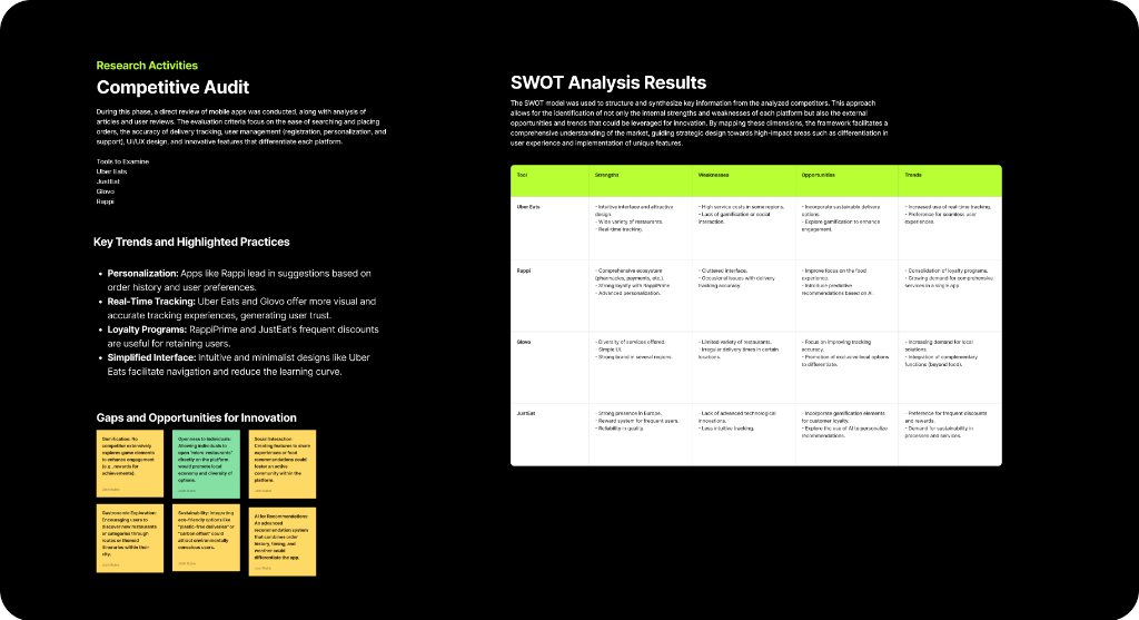
3. Competitive Audit & SWOT Analysis
I conducted a thorough analysis of the main players in the market (Uber Eats, Rappi, Glovo and Just Eat) evaluating criteria such as ease of search, order tracking, user management and innovation in UI/UX.
Key Findings:
Trends included data-driven personalization, high-precision real-time tracking, and robust loyalty programs.
SWOT Analysis:
Strengths such as Uber Eats' intuitive interface or Rappi's ecosystem were identified, but also common weaknesses such as overloaded interfaces or a lack of gamification elements.
Innovation Opportunities:
We identified areas to differentiate the app by integrating "micro-restaurants", eco-friendly delivery options (carbon offset) and advanced recommendation systems using AI.
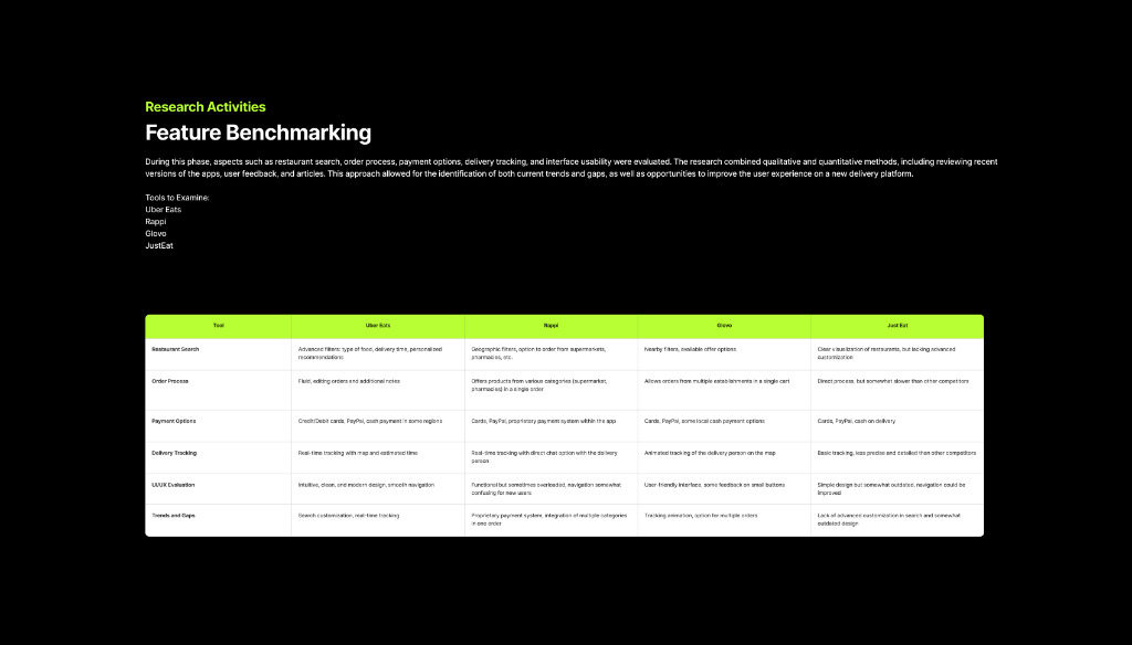
4. Feature Benchmarking
To refine the strategy, I conducted a detailed comparative study of the competition's core functionalities. This technical analysis allowed me to identify industry standards and where we could surpass the current offering.
- Restaurant search: Advanced filters vs. simple geographic searches.
- Ordering process: Smooth flow and cart editing capabilities.
- Payment options: Variety of methods, including proprietary systems and cash.
- Delivery tracking: From basic tracking to real-time animated maps.
- UI/UX Evaluation: Analysis of visual load, design modernity, and user learning curves.
This benchmarking served as a roadmap to decide which functions were "mandatory" and what our added values would be.
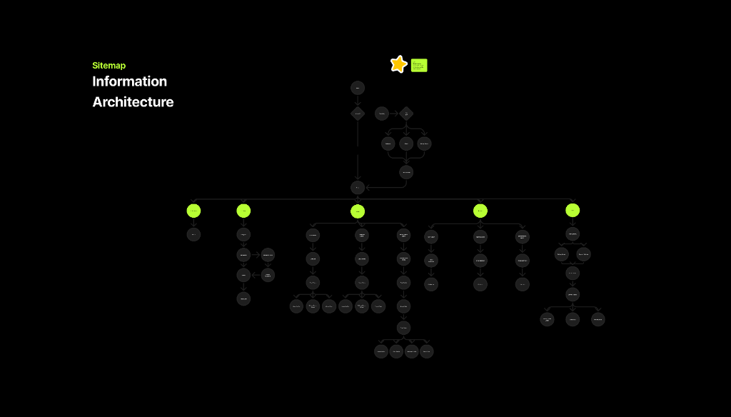
5. Site Map & Information Architecture
To ensure a logical and intuitive navigation flow, I created a comprehensive sitemap. This architectural blueprint helped visualize the app's hierarchy, defining clear paths for both User and Restaurant flows.
It served as a crucial tool for organizing content, ensuring that every screen was accessible and properly linked within the overall ecosystem, simplifying the complexity of the dual-sided platform.
The Ideation
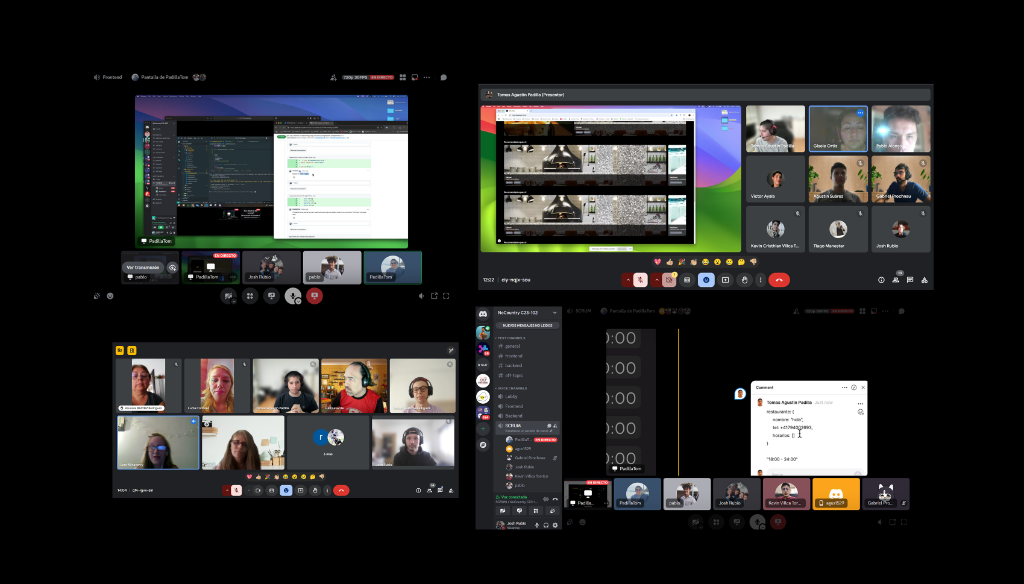
With a clear understanding that our core features needed to align with user needs, we began development using a **CRUD-based approach**. At this stage, iteration and communication were crucial. Continuous feedback loops allowed us to refine our approach, address challenges, and make necessary adjustments in real time.
By maintaining close collaboration, we ensured that our product evolved in a way that remained both functional and user-centric.
The Design
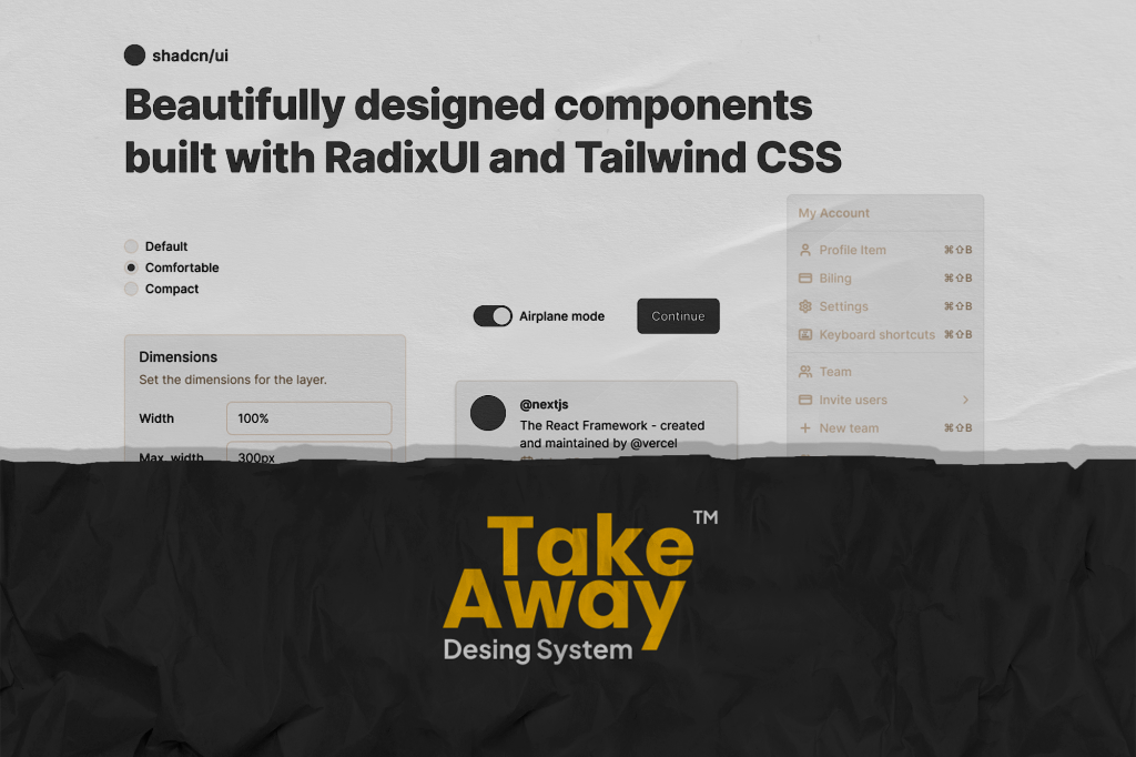
Design System
For our design system, we chose ShadCN as our foundation due to its technical feasibility and strong visual aesthetics.
Building upon this base, I expanded and customized the system to align with our specific needs, crafting a cohesive visual language tailored to our app.
Design Phase & Handoff
During this stage, I translated research insights into wireframes, created high-fidelity mockups, and established a consistent design language to guide development. I focused on interaction patterns, accessibility considerations, and usability testing to validate design decisions.
I built and maintained the design system, documented UI components for seamless handoff, and provided continuous feedback to developers to guarantee a smooth implementation. Through an iterative approach, we fine-tuned the experience, ensuring the final product met both usability standards and project requirements.
Features
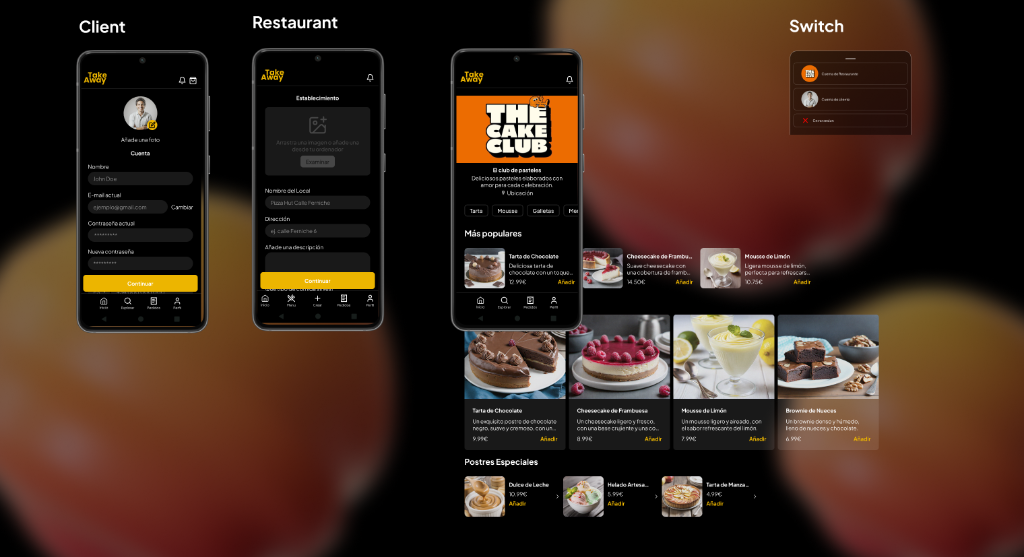
Dual Dashboard: Customization by User Role
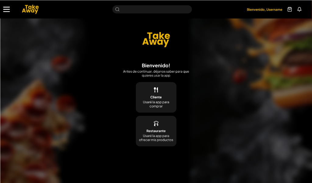
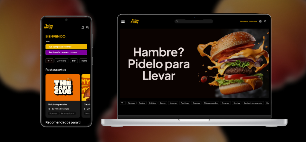
Client or Restaurant? doesn't matter, you can be both. With Take Away's personalized Dashboard you can search, find, buy or administrate your business in one place.
I designed two distinct interfaces to meet the specific needs of each player in the ecosystem. The Customer Dashboard prioritizes discovery through visual categories and promotions, while the Restaurant Dashboard focuses on operational management, displaying performance metrics, order statuses, and real-time review management to optimize decision-making.
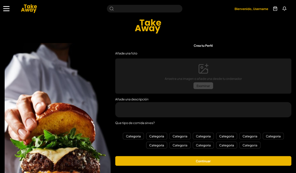
User Profiles and Restaurant Storefront
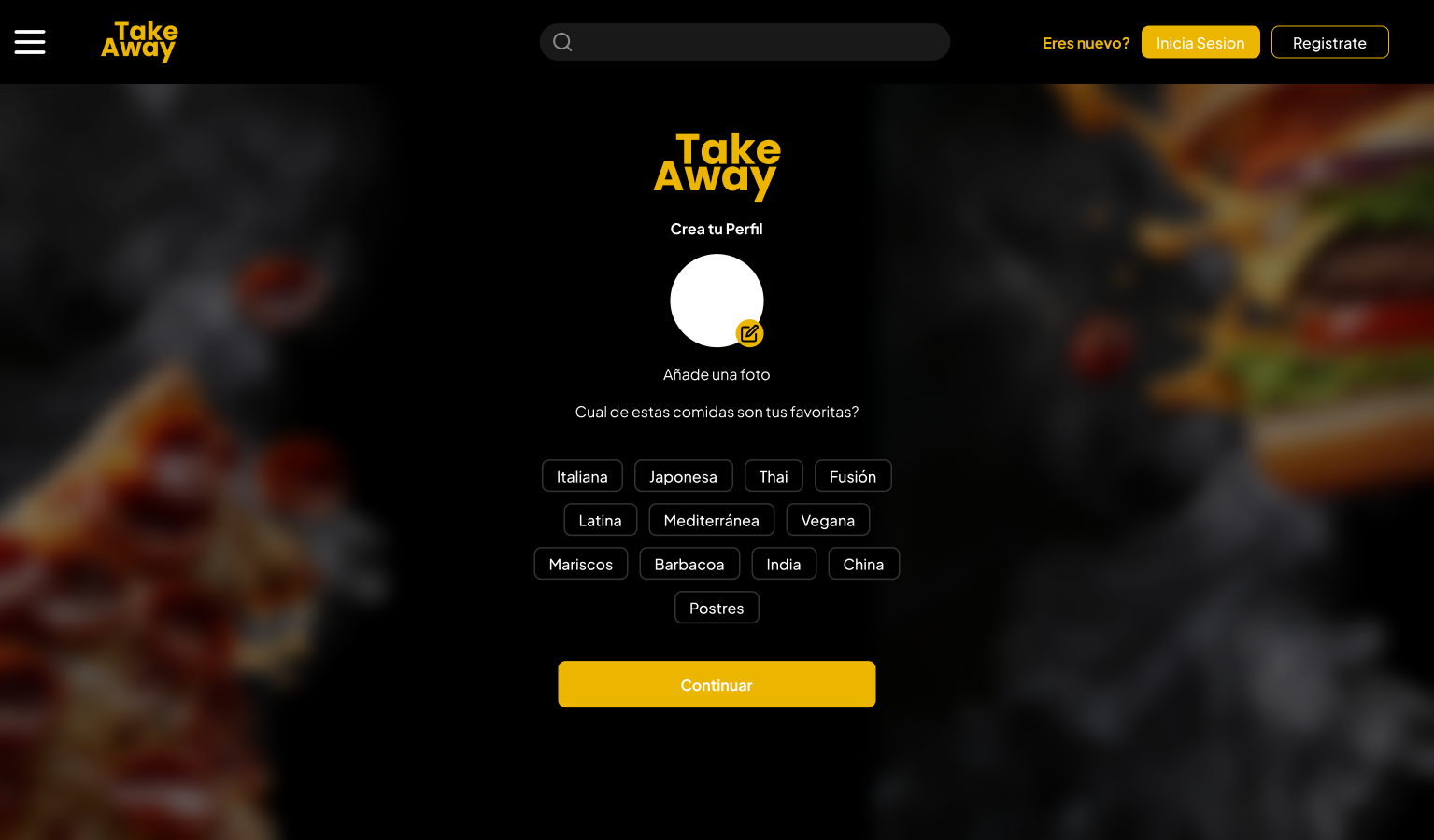
Create, edit and personalice your profile with relevant info, either if you are a client or a restaurant. Happen to be both? No problem, you switch seamlessly between your accounts.
I developed a profile management system that allows users to securely manage their personal information and login methods. For business partners, the interface allows them to configure their "virtual storefront," including cover images, descriptions, and featured menus. Additionally, I implemented a "Switch" feature to enable seamless and quick switching between client and administrator accounts.
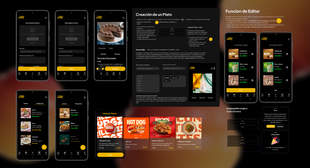
CRUD of Products and Inventory Management
Create, organizce, discover and buy—these are the phases of a product lifecycle across the Restaurant and Client user experience.
To facilitate the restaurant's autonomy, I designed a complete workflow for creating and editing dishes. The interface uses input chips for quick categorization and dynamic forms for defining prices and descriptions. Confirmation statuses and deletion warnings were included to prevent accidental errors, ensuring smooth and intuitive inventory management.
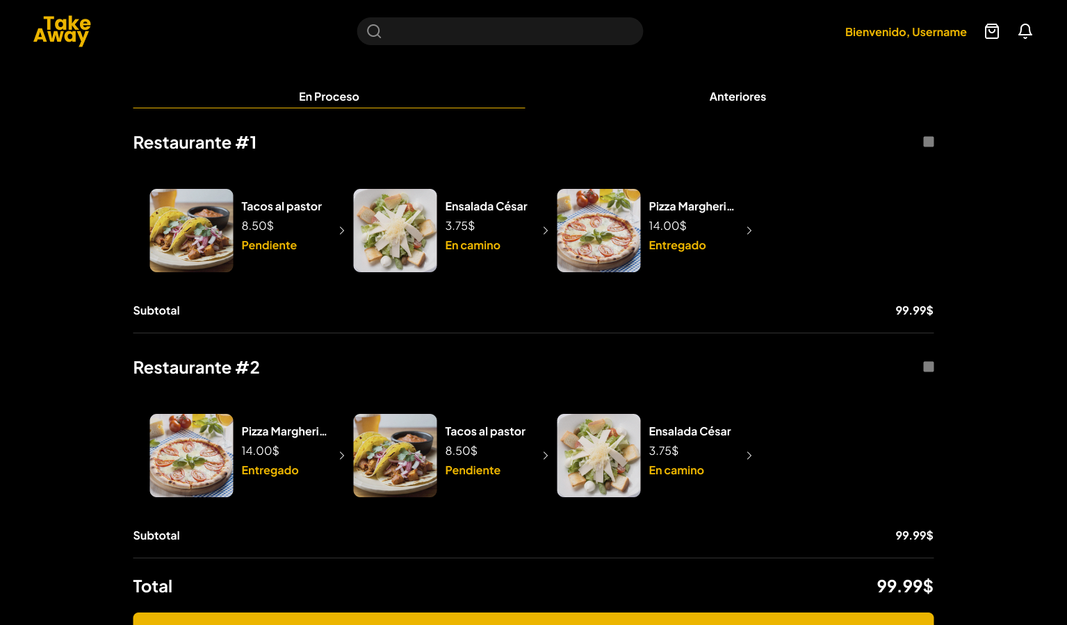
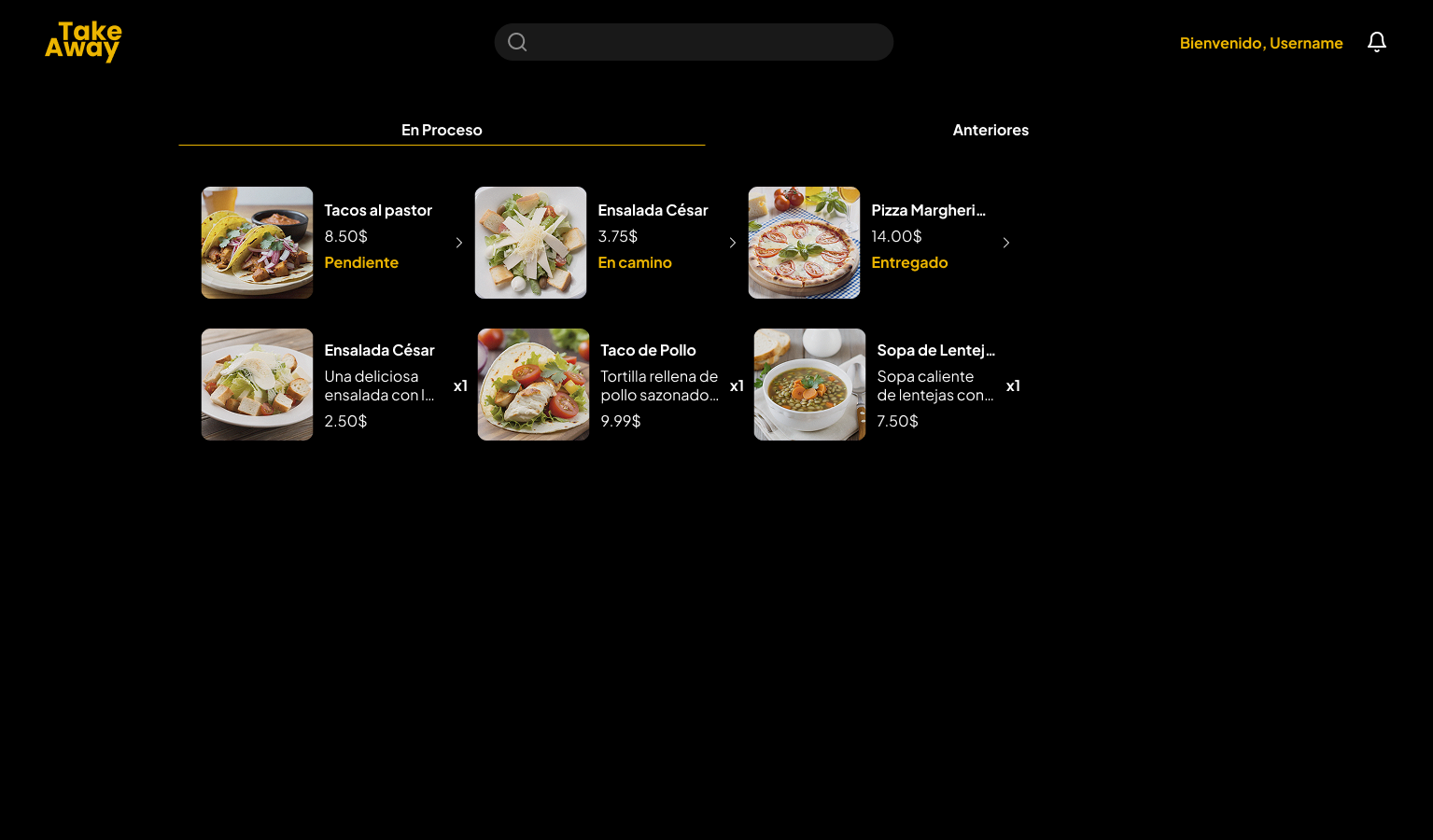
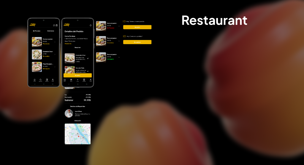
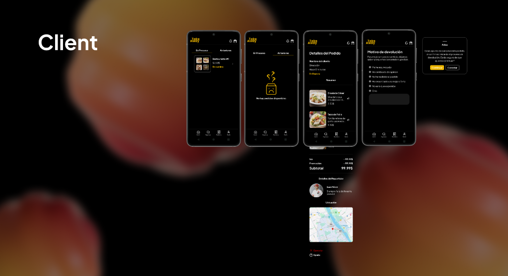
Order Placement & Management
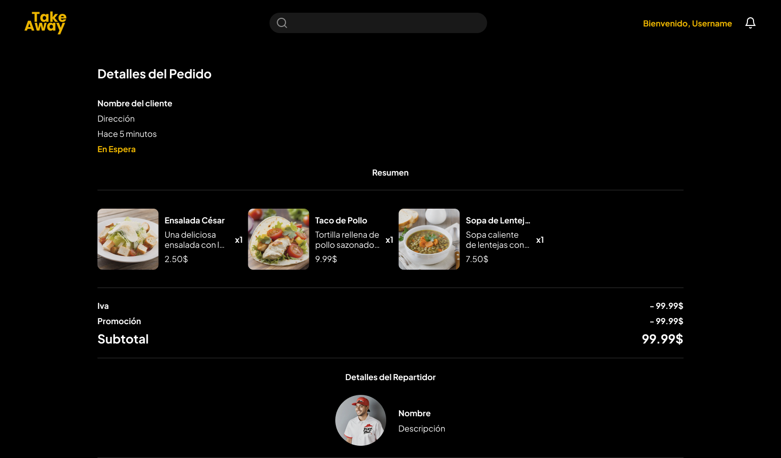
Make, receive and track your orders state from wherever you are, by clicking into the "orders" button on the tool bar.
For Customers: Real-Time Tracking
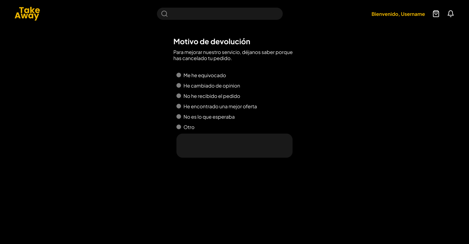
The customer experience focuses on transparency in the delivery process. I designed a tracking interface that integrates real-time maps, detailed order information, and direct contact with the delivery driver. Additionally, I incorporated a cancellation flow with qualitative feedback, allowing the system to collect data on reasons for returns for future operational improvements.
For Restaurants: Logistics Control Console
I optimized the restaurant's workflow with an order console that allows you to change the preparation status (Pending, Accepted, On the Way, Delivered) with a single tap. The UI automatically breaks down taxes, promotions, and subtotals, providing financial and operational clarity for both the kitchen staff and delivery logistics.
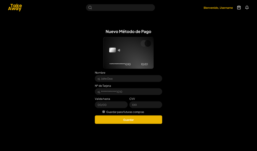
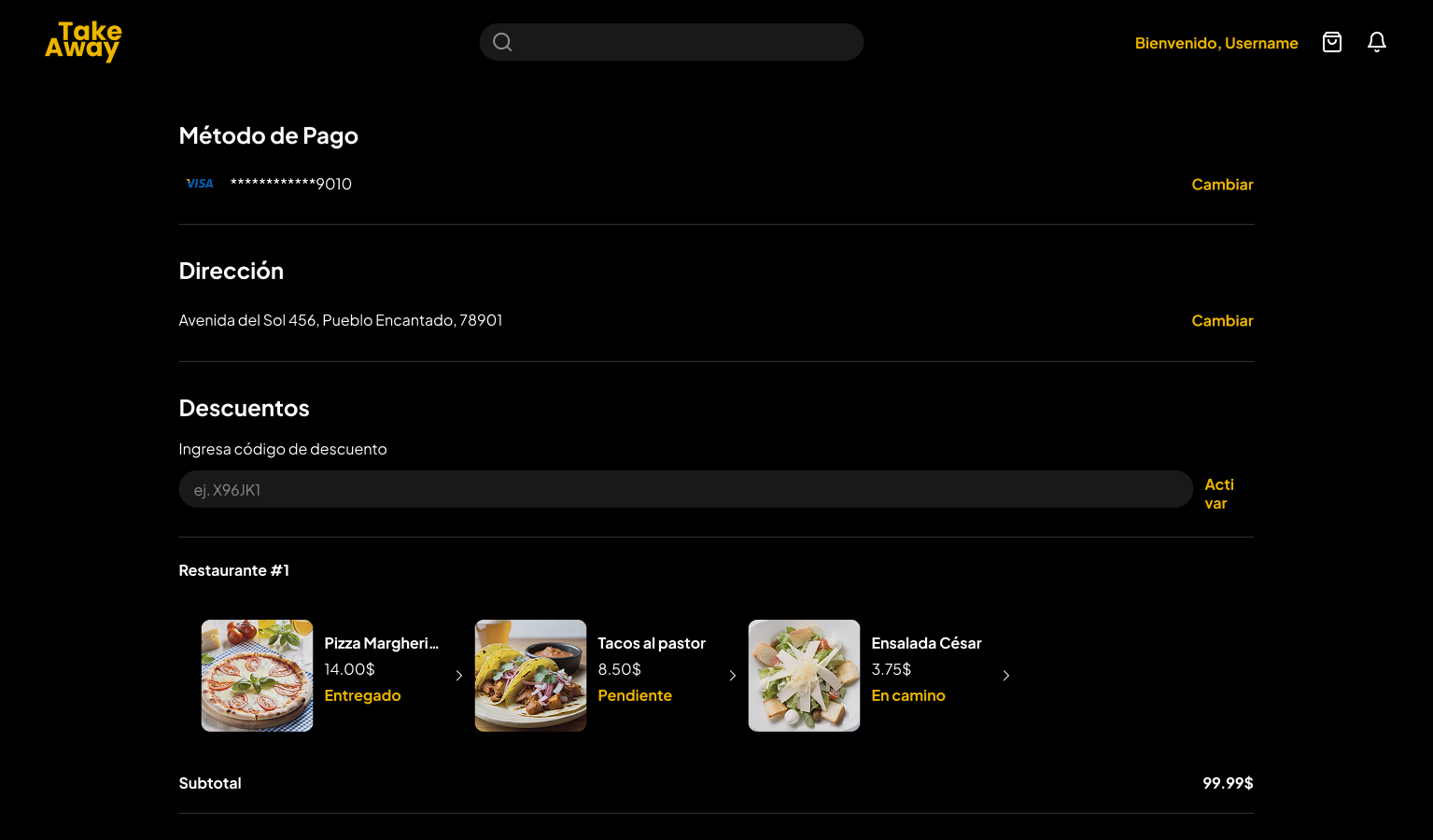
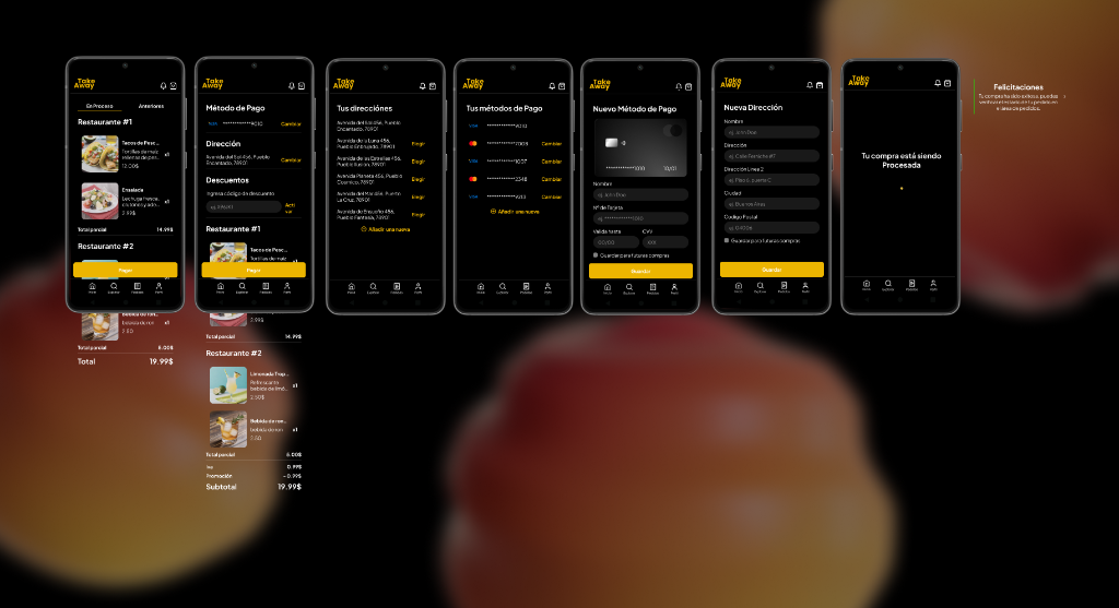
Checkout and Payment Process
Once your order is placed you can check, add and modify your order, even switch between your payment methods and delivery addresses.
Payment Flow and Financial Management
The checkout process was simplified to reduce cart abandonment. I implemented a multi-selection system for saved addresses and payment methods, allowing for a quick transition from order review to final confirmation. The interface guides the user through each step (add card, new address) while maintaining visual consistency and security for every transaction.
Outcome & Learnings
In just five weeks, we successfully delivered a functional MVP that addressed the core needs of both restaurants and customers. Working in an Agile environment allowed us to iterate quickly, adapting to technical constraints without sacrificing user experience.
This project reinforced the importance of a scalable design system and clear communication between design and development. The final product is a robust, dual-sided platform that simplifies food delivery logistics while providing a seamless ordering experience.
Project Gallery