
Brand design
The Long Run - Brand Identity
A pet nutrition brand that borrows the language of old-school track and field. One promise, More Days Together, carried by a wordmark, a badge, a running dog and cat, and a color system where only the flavor changes.
Role
Brand Designer
Category
Pet nutrition
Scope
Identity, packaging, social, email
Brand book
v03, Sept 2026
1. Overview
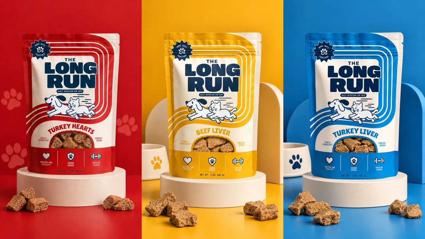
Every part of the identity exists to carry one promise: More Days Together. The Long Run makes single-ingredient, freeze-dried treats for dogs and cats that are human grade, protein packed and crafted for vitality. The name and the track-and-field world it borrows from say the same thing twice: this is nutrition built for a lifetime, not a trend.
I designed the identity system, applied it to packaging, social and apparel, and then rebuilt the brand's email program on top of it, working under the supervision of the Proventheory team. The result is a brand that is documented in a 24-slide brand book, and where every element ships as a locked file that is used exactly as supplied.
⚠️ The Brand Challenge
Pet food is a crowded shelf, and most of it talks the same way. The owner is skeptical about what is in the bag, and the category leans on pastel palettes, cartoon mascots and claims nobody can back up.
- Trust: the brand has to signal "this is real food" in seconds, from three meters away
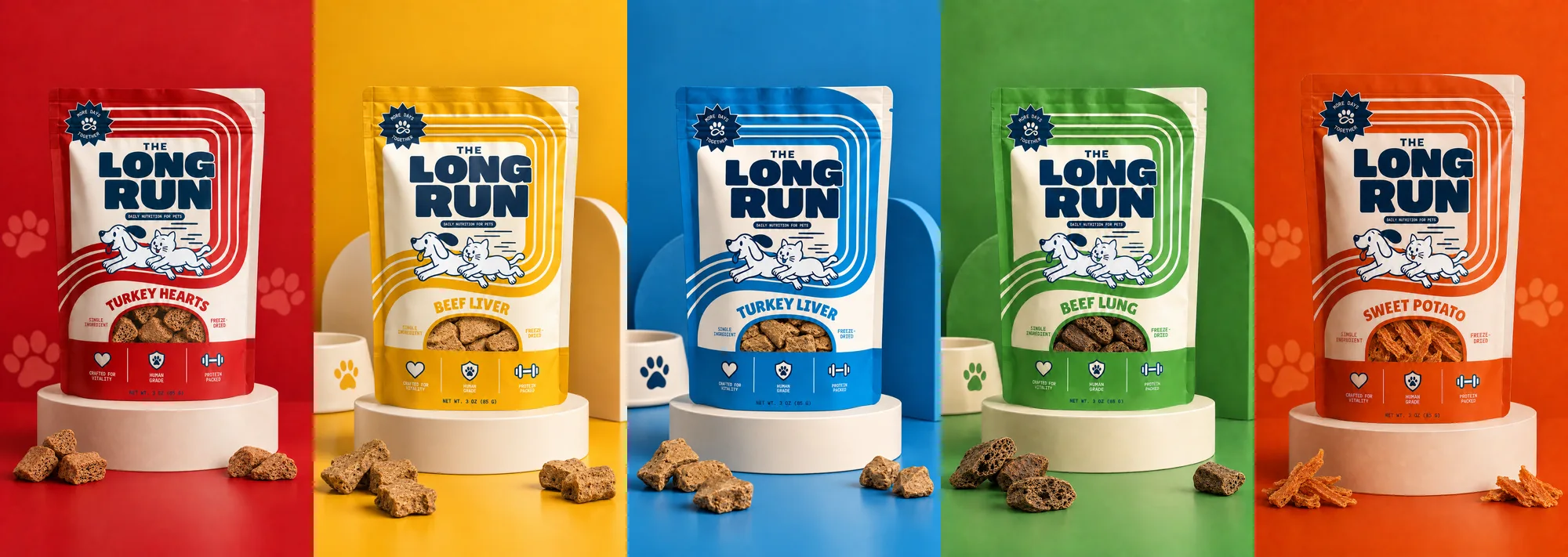
- Range: five treat flavors, a Minis format and a spray family all have to feel like one brand
- Consistency: the same identity must survive a pouch, a tee, a booth and an inbox
2. Strategy and Positioning
The positioning is warm, never cute. Instead of talking to the owner as if they were a child, the brand speaks like a family diner that happens to know exactly what is in the food, and it borrows from 1950s diners, vintage sports uniforms and old-school athletics. The references are nostalgic, confident and a little worn in.
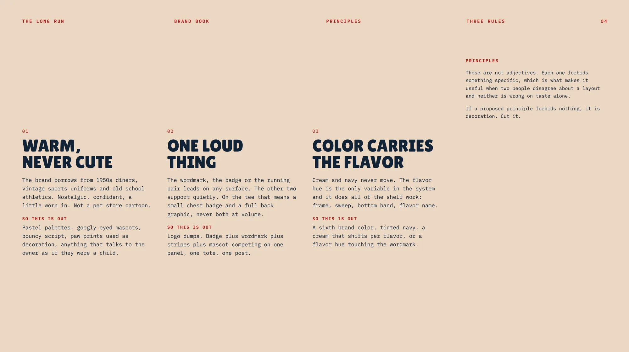
The strategy is written as three rules, and each one forbids something specific. That is what makes them useful when two people disagree about a layout and neither is wrong on taste alone.
Warm, never cute: No pastel palettes, googly-eyed mascots, bouncy script or paw prints used as decoration.
One loud thing: The wordmark, the badge or the running pair leads on any surface. The other two support quietly.
Color carries the flavor: Cream and navy never move. The flavor hue is the only variable, and it does all of the shelf work.
3. The Identity System
A logo family with a clear hierarchy
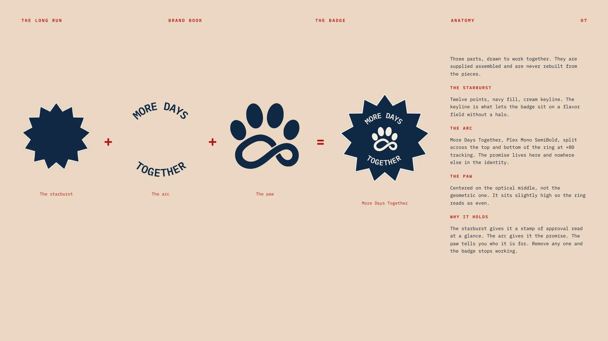
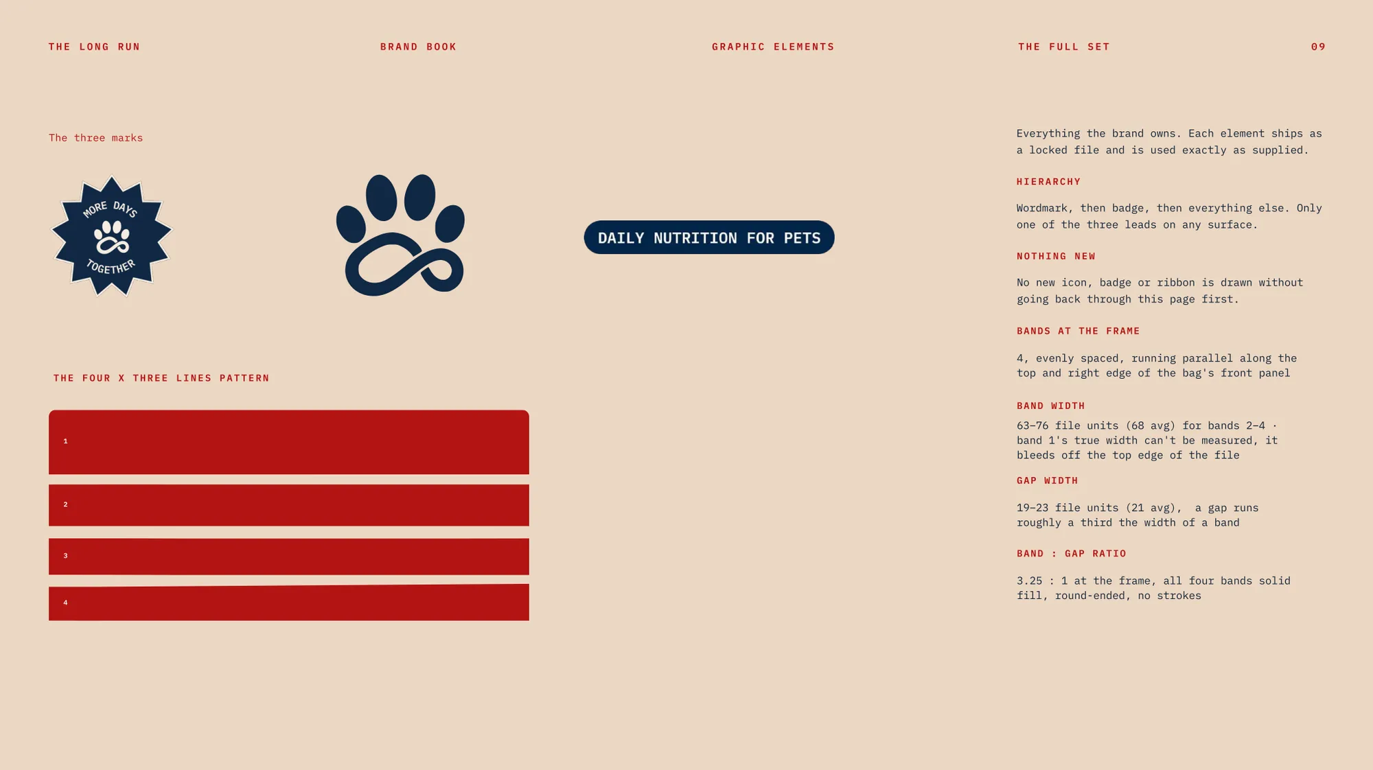
The identity is a small set of locked assets in a strict order: wordmark, then badge, then everything else. The wordmark is set in Lilita One with a cream offset outline and fills the width it is given. The badge is a twelve-point starburst carrying a paw, with More Days Together set around it. The mark is a four-toe paw whose pad is an infinity loop, so it reads as a paw first and as "forever" second, once someone is holding the pack.
The badge is deliberately built from three parts, the starburst for the stamp of approval, the arc for the promise, and the paw for who it is for. Remove any one and it stops working.
4. Color and Typography
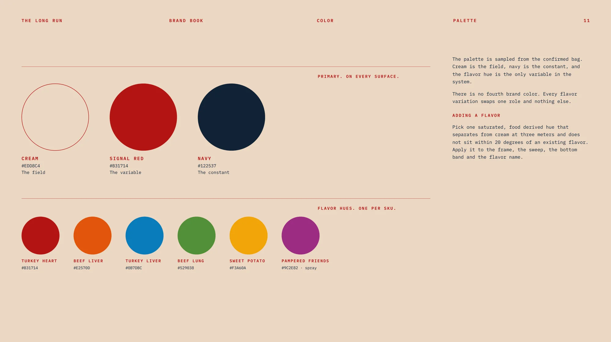
The palette is sampled from the confirmed bag and built on a simple logic: cream is the field, navy is the constant, and the flavor hue is the variable. There is no fourth brand color. To add a flavor, you pick one saturated, food-derived hue that separates from cream at three meters and sits at least 20 degrees away from any existing flavor.
| Role | Color | Rule |
|---|---|---|
| The field | Cream #EDD8C4 | Present on every surface. |
| The variable | Signal Red #B31714 | Also the Turkey Hearts flavor hue. |
| The constant | Navy #122537 | Never tinted. |
| Flavor hues | Blue #0B7DBC, green #529038, gold #F3A60A, orange #E2570D, purple #9C2E82 | One per SKU: frame, sweep, bottom band and flavor name. Never on the wordmark. |
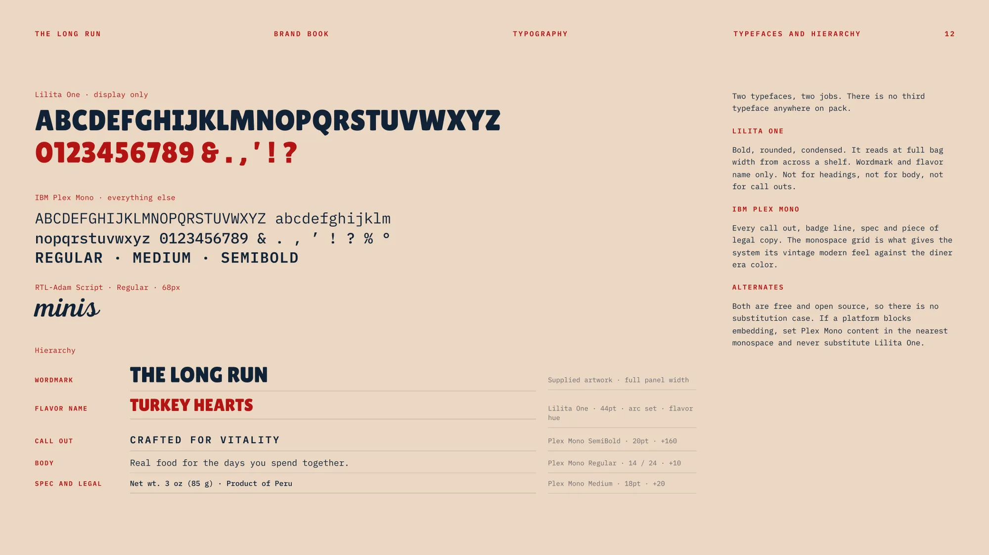
Type follows the same discipline: two typefaces, two jobs. Lilita One is for the wordmark and flavor names only, because it is bold and rounded enough to read at full bag width across a shelf. IBM Plex Mono handles every call out, spec and line of legal copy, and its monospace grid gives the system a vintage-modern feel against the diner-era color. Both are free and open source, so there is never a reason to substitute.
5. Illustration and Motion
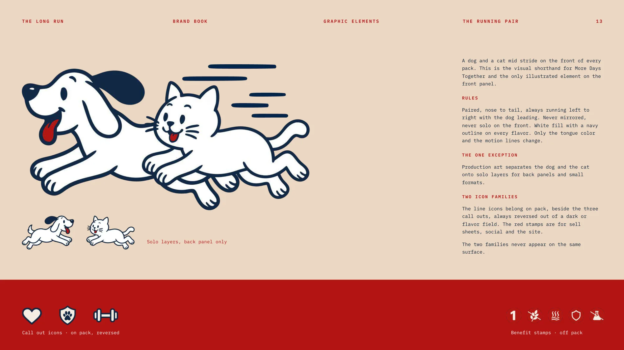
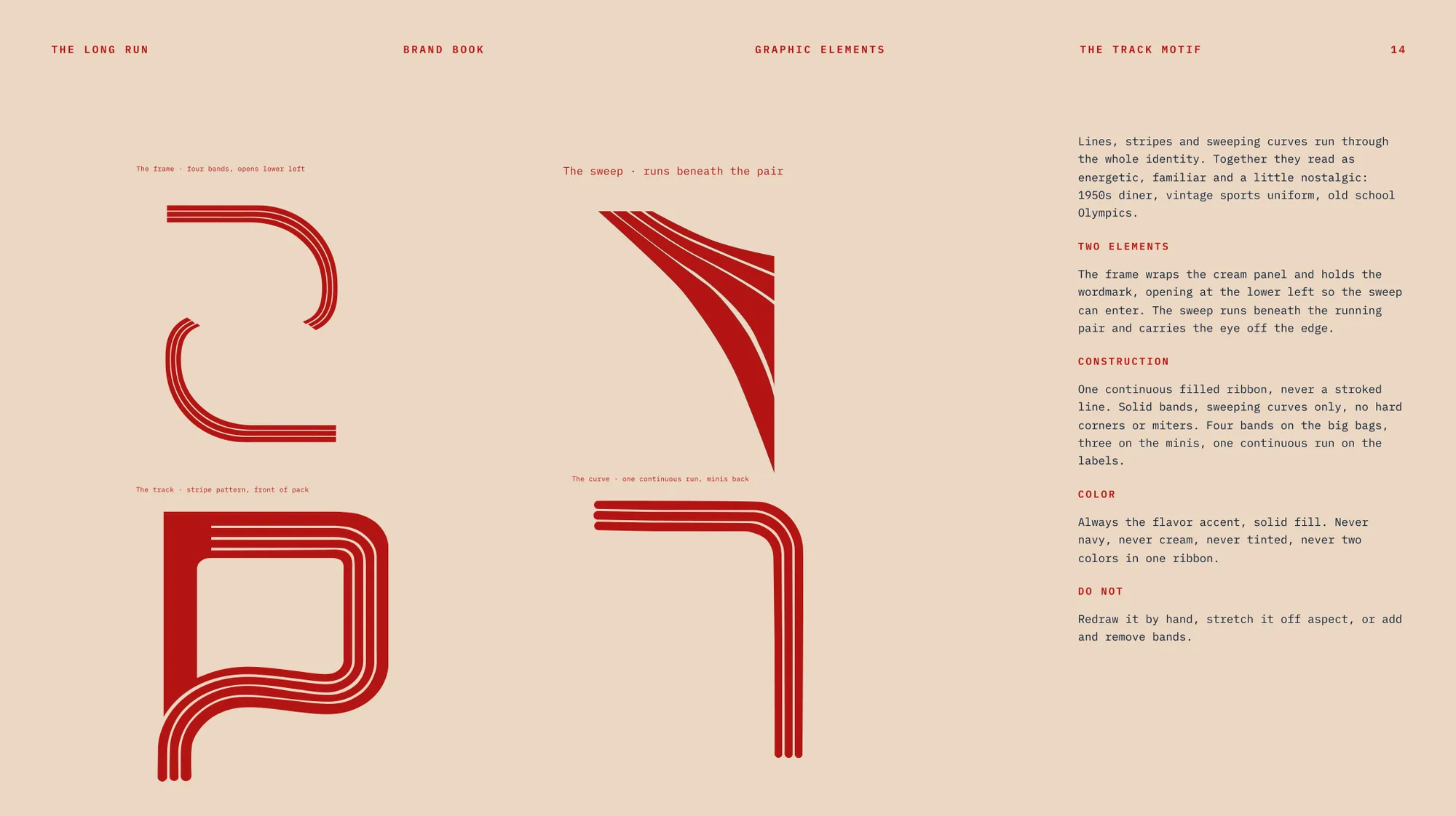
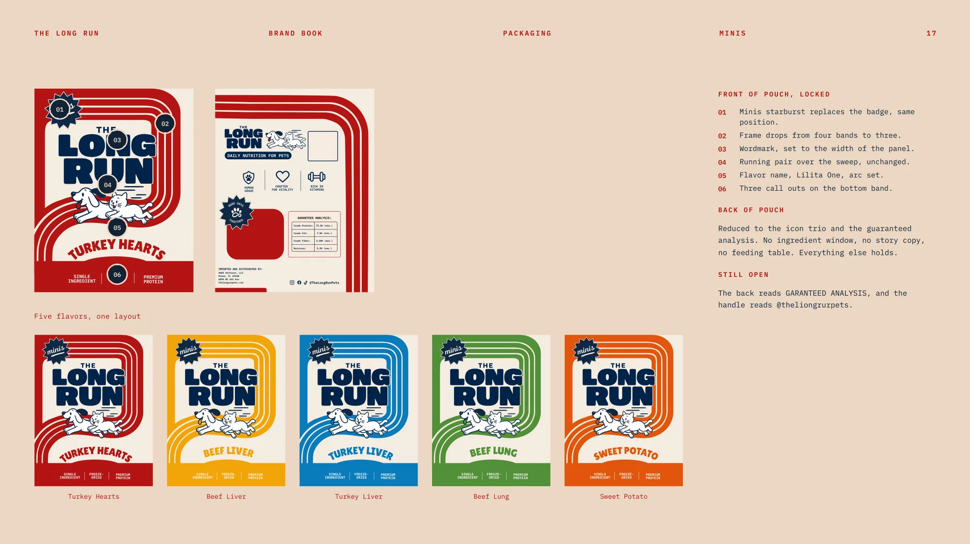
Two graphic devices give the brand its energy. The running pair is a dog and a cat mid-stride, always nose to tail, always left to right with the dog leading. It is the only illustrated element on the front of a pack and the visual shorthand for the promise. The track motif is a set of solid ribbons that frame the cream panel and sweep beneath the pair, opening at the lower left so the eye is carried off the edge: four bands on the big bags, three on the Minis, one continuous run on the labels.
6. Voice
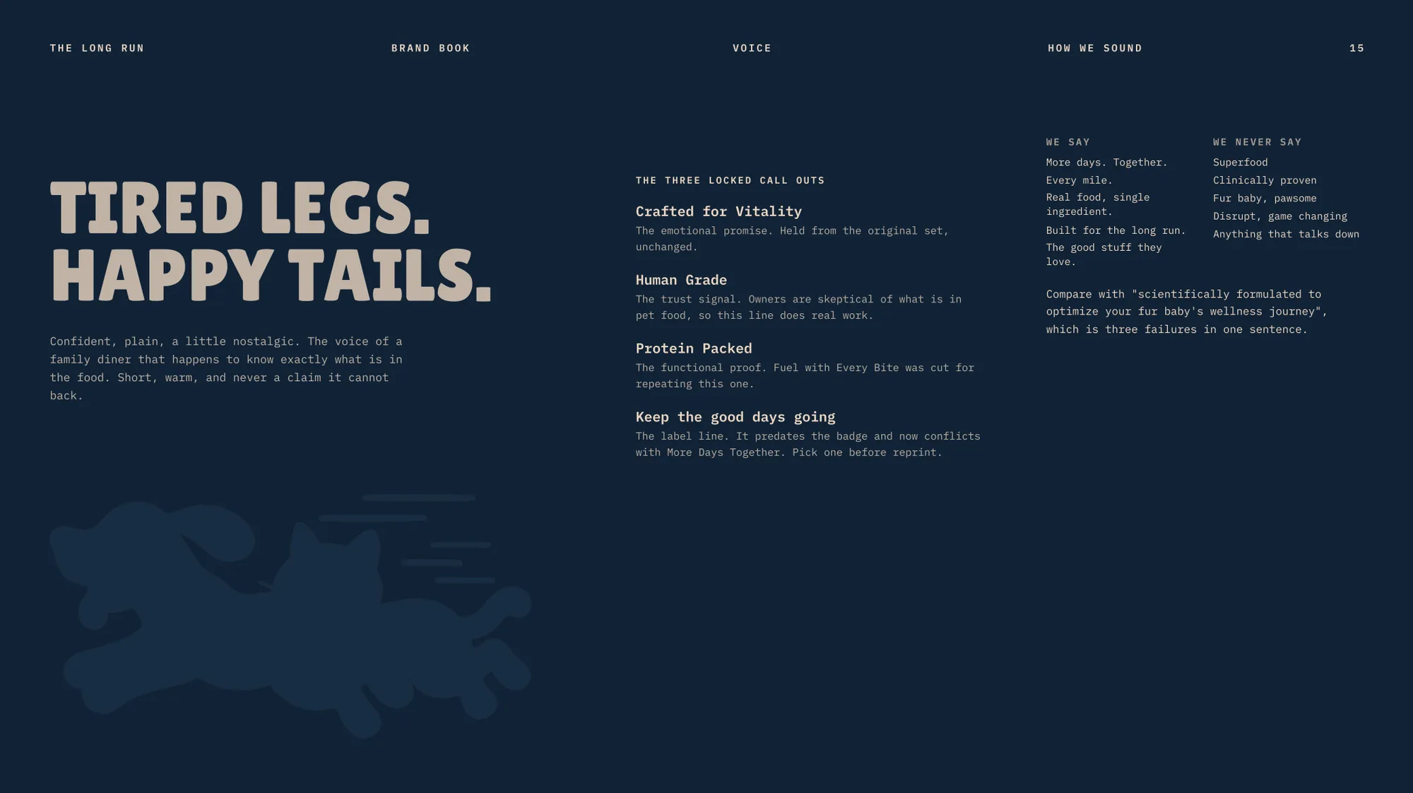
The voice is confident, plain and a little nostalgic, and it never makes a claim it cannot back up. Three locked call outs carry the product: Crafted for Vitality as the emotional promise, Human Grade as the trust signal, and Protein Packed as the functional proof. The book also lists what the brand never says, so that copywriters have the same guardrails as designers.
Tired legs. Happy tails.
From the brand book, voice page
7. Applied: Packaging
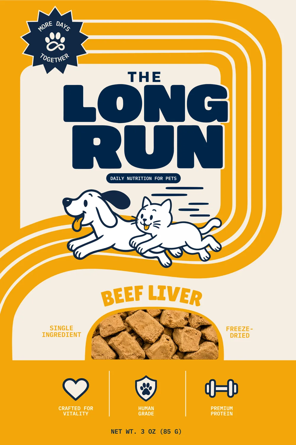
Packaging is where the system does the most work. Each front panel follows eight locked elements: badge breaking the frame, a frame in the flavor hue, the wordmark at panel width, the descriptor, the running pair over the sweep, the flavor name, a window that shows the actual product, and the three call outs on the bottom band. Five flavors then share one layout and swap a single color.
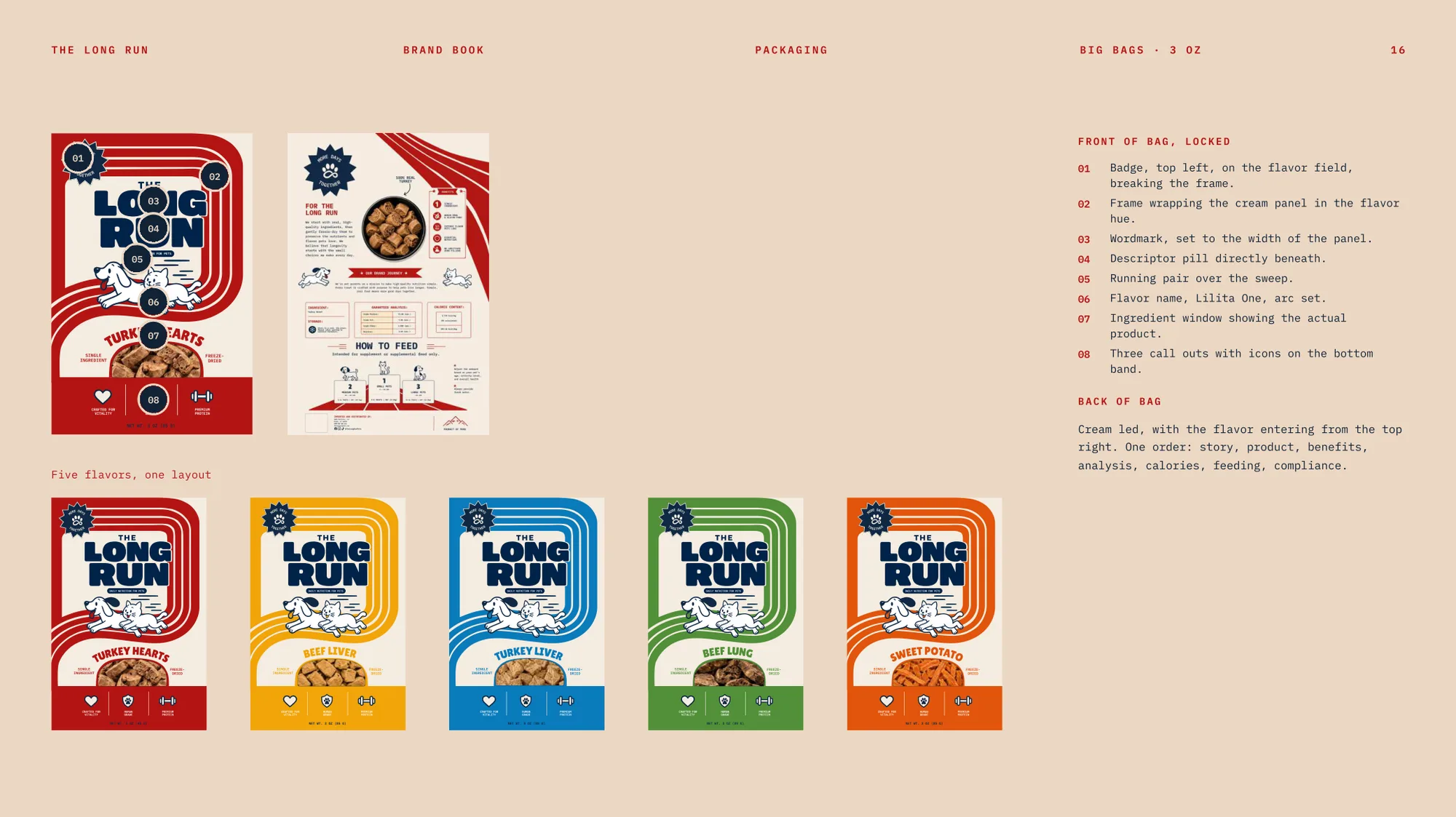
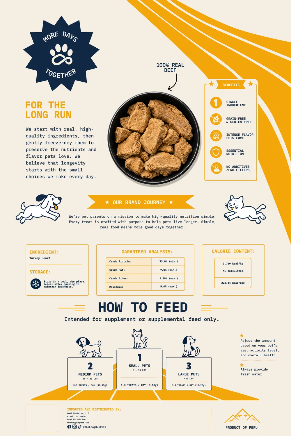
The back of the bag is cream-led, with the flavor color entering from the top right and one fixed reading order: story, product, benefits, analysis, calories, feeding, compliance. The Minis pouch keeps the same skeleton but drops the frame from four bands to three, replaces the badge with a smaller starburst, and reduces the back to the icon trio and the guaranteed analysis.
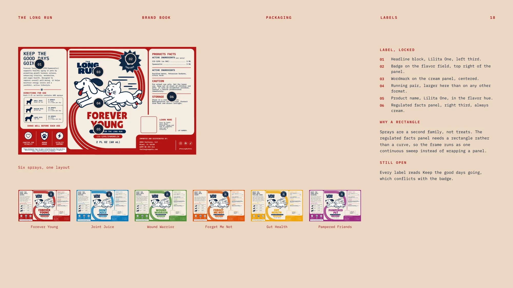
A third family, the spray labels, needed a regulated facts panel, so the frame runs as one continuous sweep instead of wrapping a panel. A rectangle was the right shape for the required information, and the identity bends to it without losing the badge, the running pair or the color logic.
8. Applied: Social, Patterns and Print
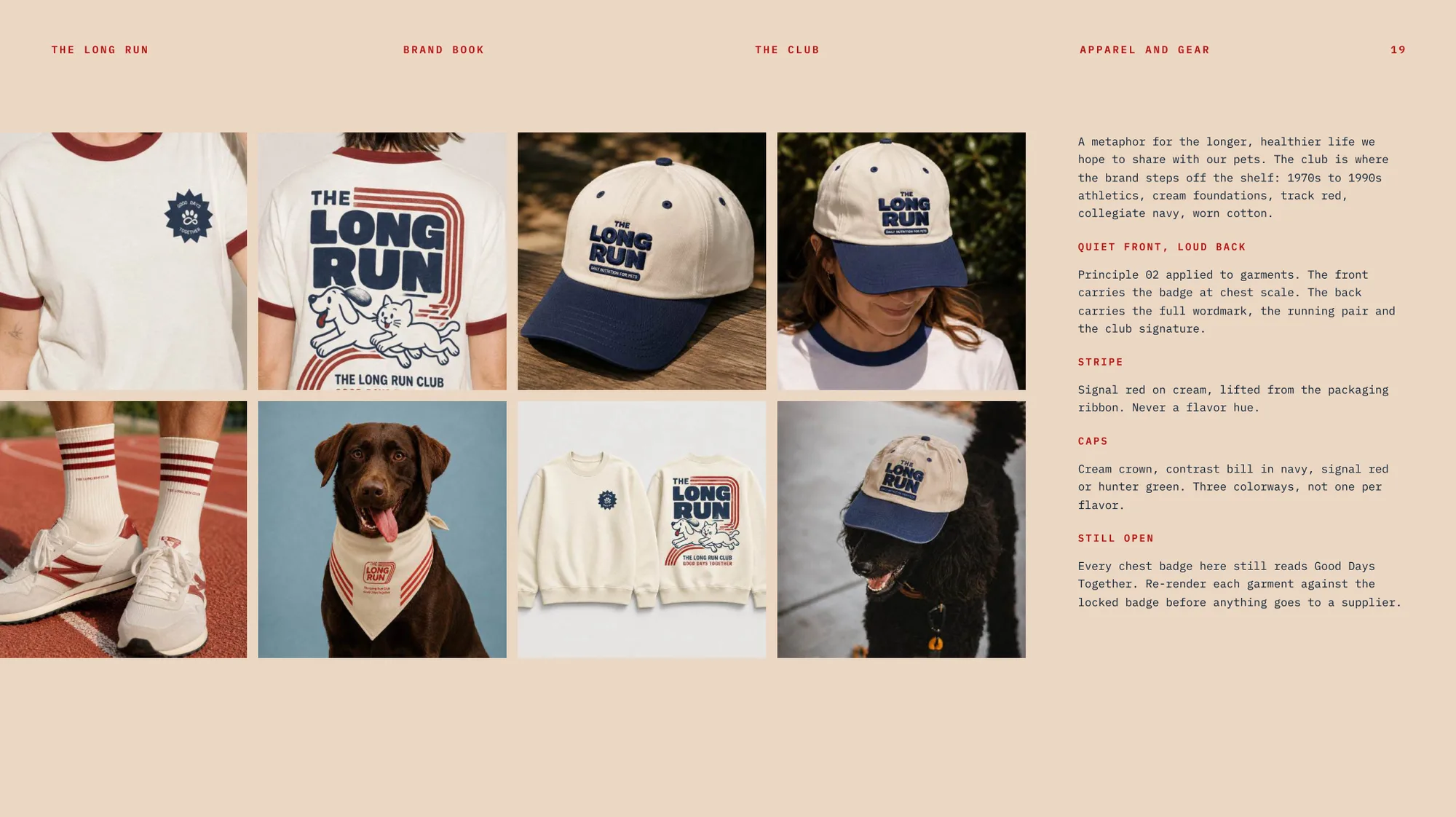
Off the shelf, the brand needs to feel like a club, not a catalog. The apparel line, The Long Run Club, is a metaphor for the longer, healthier life owners hope to share with their pets, and it is built on Principle 02: quiet front, loud back. A small badge sits on the chest, and the full wordmark and running pair go on the back.
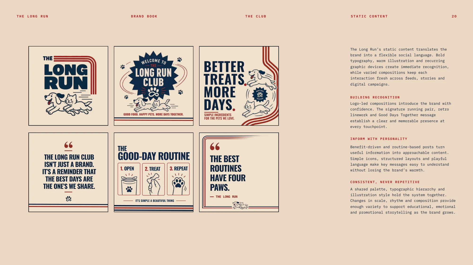
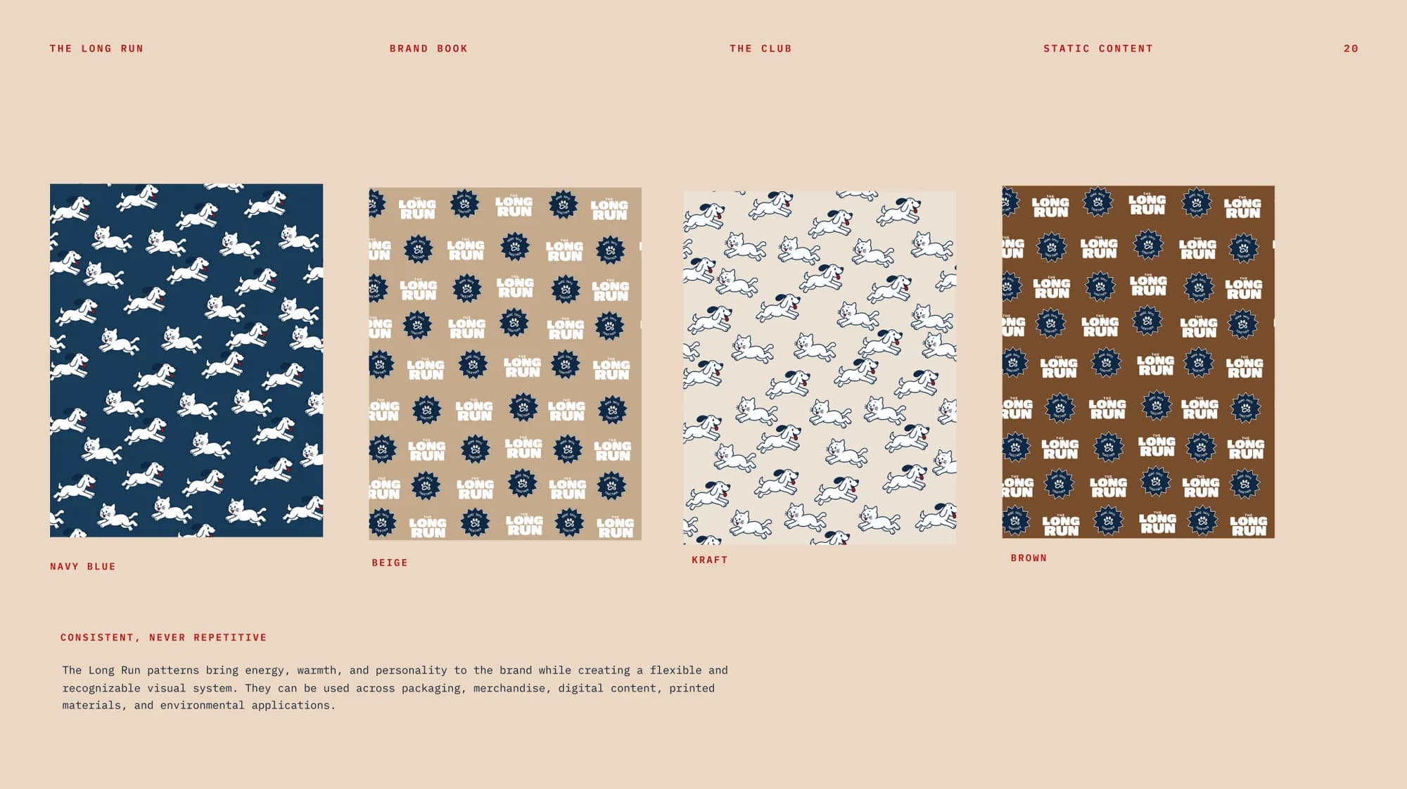
Static social content translates the identity into a flexible social language: logo-led posts build recognition, benefit and routine posts inform with personality, and a shared palette and hierarchy keep varied compositions consistent without repeating. The feed itself is photography-first, with one product post for every three lifestyle or club posts.
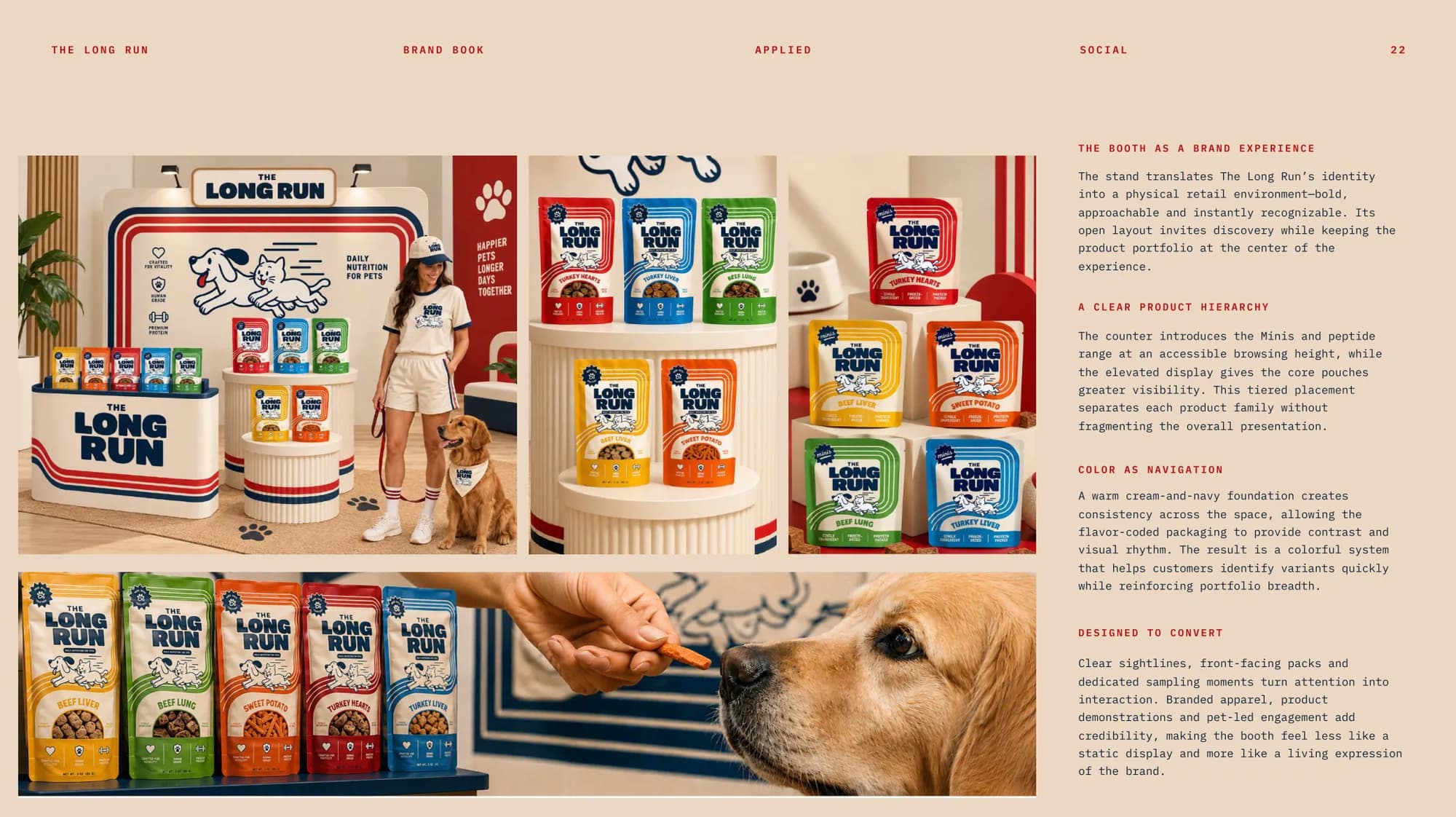
The same kit extends into a physical space. The booth concept uses a tiered display: a counter for the Minis and the spray range at browsing height, and an elevated stand that gives the core pouches more presence. Cream and navy hold the space together, and the flavor-coded packs provide the contrast and the wayfinding.
9. Applied: The Email System
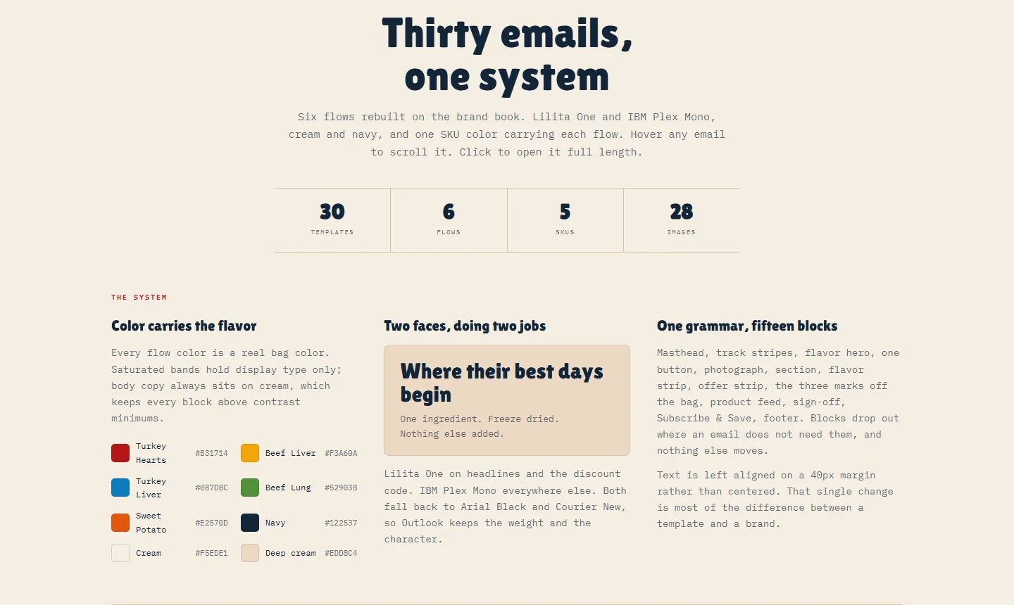
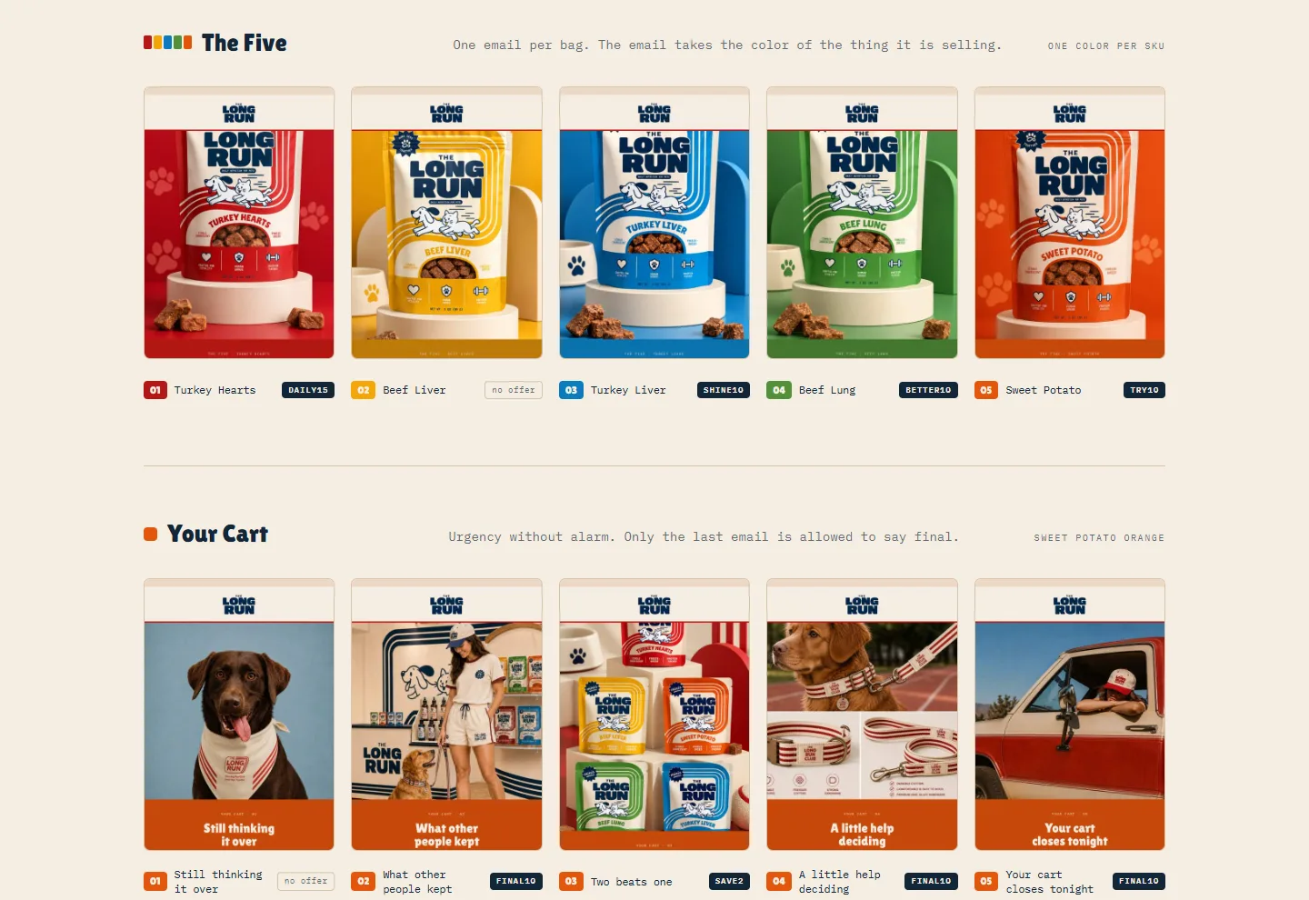
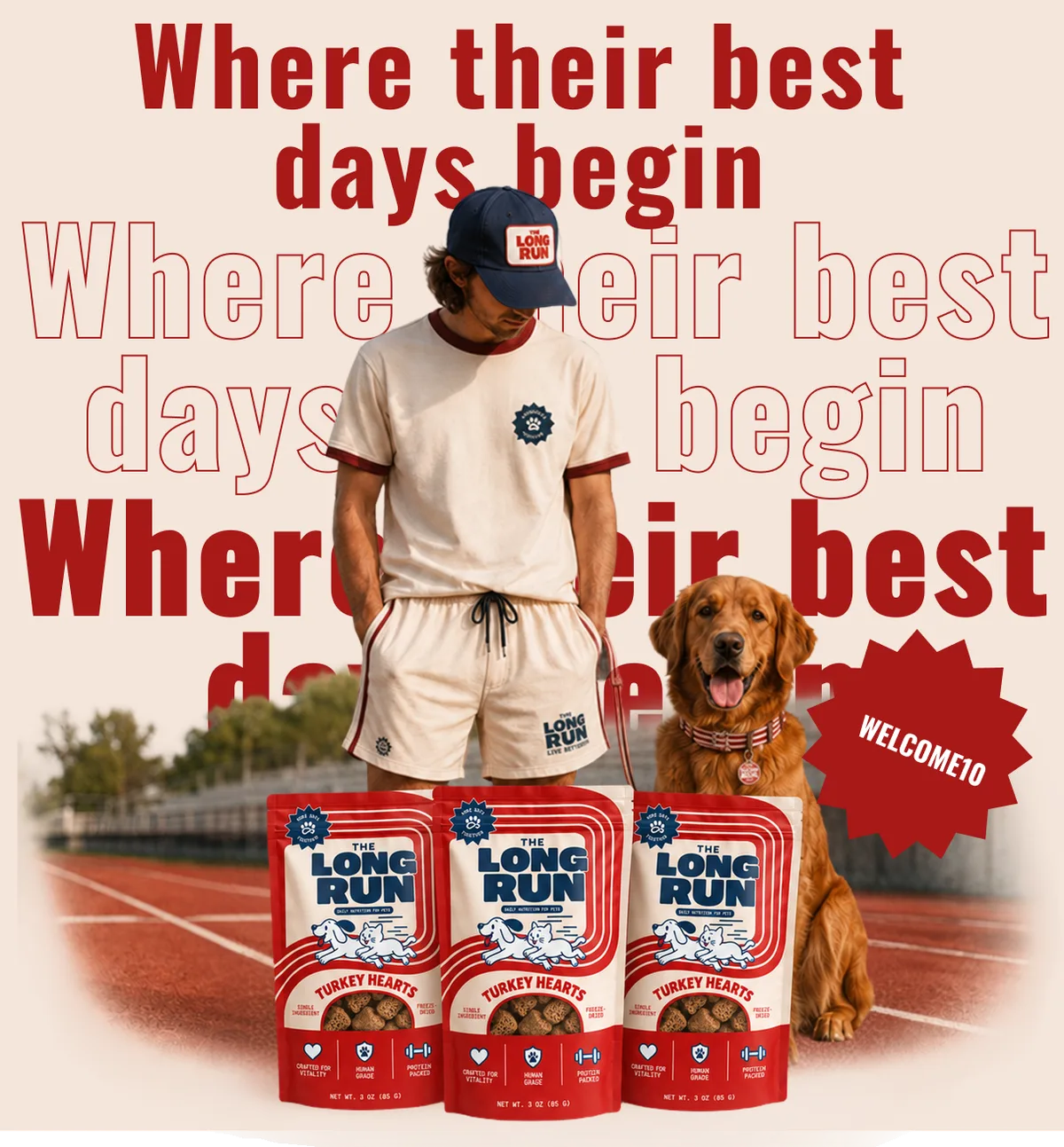
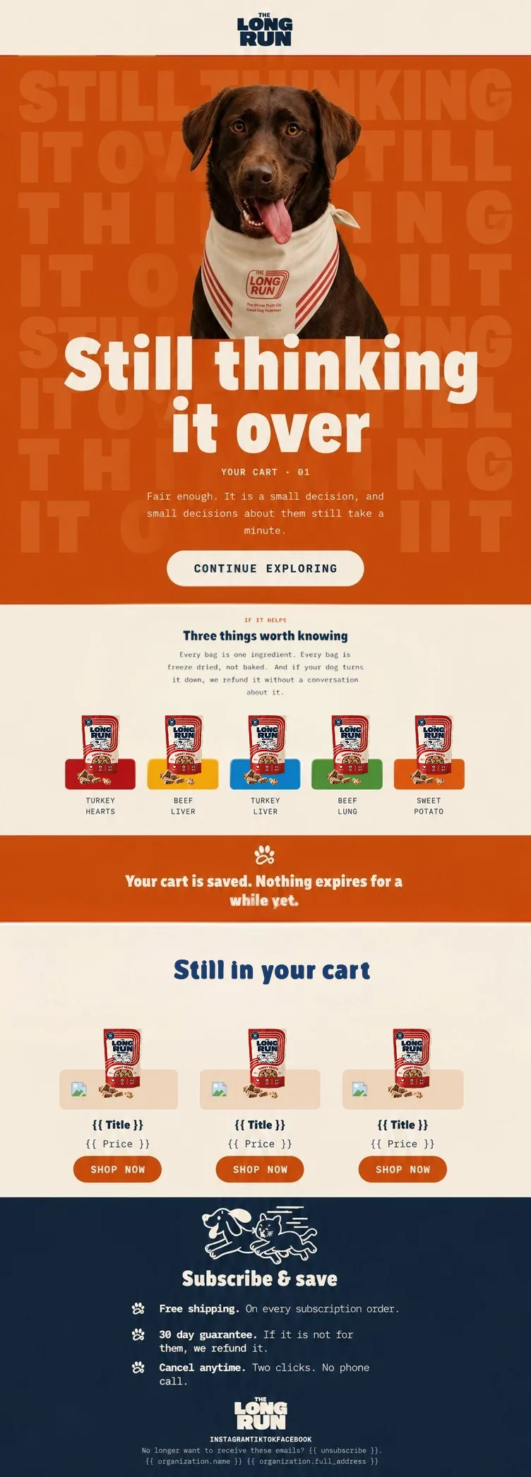
The last area was email, where a brand usually falls apart: templates get built one at a time, with different fonts, colors and voice. I rebuilt six flows on the brand book, thirty emails in total, as a single system with one grammar of fifteen blocks. Blocks drop out when an email does not need them, and nothing else moves.
Color carries the flavor: Each flow takes one real bag color. Saturated bands hold display type only, and body copy always sits on cream, which keeps every block above contrast minimums.
Two faces, two jobs: Lilita One on headlines and the discount code, IBM Plex Mono everywhere else, with Arial Black and Courier New fallbacks so Outlook keeps the weight and the character.
Left aligned, 40px margin: Text is left aligned instead of centered. That single change is most of the difference between a template and a brand.
Tone by flow: Welcome keeps the offer quiet, Your Cart creates urgency without alarm, and only the last cart email is allowed to say final.
30
email templates
6
flows
5
SKU colors
15
content blocks
Fixing what could not both be true
Rebuilding the flows was also an audit. It surfaced five contradictions in the original emails, and all of them were fixed: a button that promised 15% over a body that promised 10%, three emails that all called themselves the final one, a discount code with an ampersand that breaks some checkouts, and two refill emails with mismatched or missing codes. Every discount code was otherwise carried over unchanged so nothing needs rebuilding in Shopify. Three other calls, such as a cart offer ladder that runs backwards, I left for the client to decide.
10. Deliverables
24
brand book slides
3
brand marks + running pair
5
flavors, big bag and Minis
6
spray labels
30
email templates
Brand book: Foundation, principles, logo rules, palette, typography, voice and applications, with a page on what breaks the logo.
Packaging: Big bag and Minis fronts and backs in five flavors, plus six spray labels.
Social, apparel and patterns: Static post system, Long Run Club apparel and gear, repeat patterns and a booth concept.
Email system: Six flows, thirty templates, one block grammar, ready to hand off to Klaviyo.
The brand book is honest about what is still open: three taglines are live at once, and a few copy corrections remain on the packaging before anything reprints. It lists them on the last page rather than hiding them.
Key Takeaways
- Rules that forbid something: A principle that forbids nothing is decoration. Each of the three rules can settle a layout argument.
- Let one thing change: Locking cream and navy and letting only the flavor hue vary made five SKUs feel like one brand.
- Ship locked files: The wordmark, badge, mark and pattern are supplied artwork and never re-set, which protects the brand from good intentions.
- Brand shows up in the inbox: Email is where identity usually falls apart, so it needed a system and an audit, not a template pack.
Next steps: Choose a single tagline before reprint, re-render the apparel mockups against the final badge, and measure how the flows perform once they go live.