
One design system, five identities: making a family of apps feel distinct
How a shared neutral base and four deliberate axes of difference made five small demo apps look like they came from one designer without looking like reskins.
Author
Josh D. Rubio
Published
Reading time
6 min read
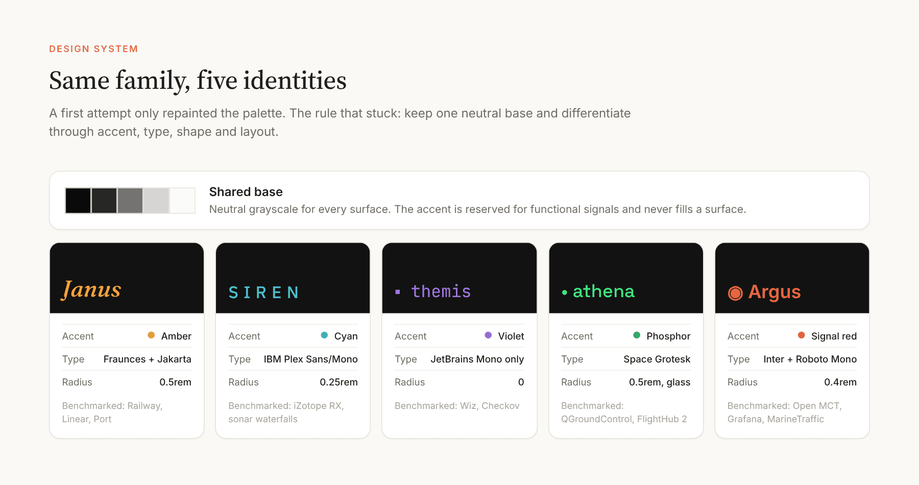
Build several products in a row and you hit a design problem that has nothing to do with any single screen: how do you make them feel like a family without making them look like the same app in different paint? I ran into it directly with Siegfried, the control plane I built to plan and ship five small satellite apps: Janus, Siren, Themis, Athena and Argus.
Each one lives in a domain that is not my own: developer platforms, underwater acoustics, compliance, drone planning and operations consoles. I wanted each to feel native to its field, and I wanted all five to be clearly mine.
The first attempt was a reskin
For Janus, I started where most people do: take the Siegfried look and change the palette. A warm cream and terracotta theme over the same structure. It read exactly like what it was: a reskin. Color alone is the cheapest difference there is, and it shows.
I rejected that version and turned the failure into the rule for all later satellites: never differentiate by palette alone.
A shared base and four axes
The rule that replaced it has two halves.
Shared. Every satellite starts from the same neutral grayscale base for its surfaces. That is the part that makes them a family. It also removes a lot of decisions, so each new app began from where the last one stopped.
Different. The identity is built from four things, none of which is a general-purpose color scheme:
- An accent reserved for functional signals. It appears on the active state, the primary action, status indicators and data. It is not used for decoration. That restraint is what makes it feel like part of the product.
- A type pairing. Typefaces carry more personality than most designers admit.
- A corner radius. Soft, tight or none at all changes the character of every component at once.
- A layout grammar. How the page is organized: where tools sit, how panels dock, how dense things are.
The satellites' design lives in these four axes. The base stays the same on purpose.
Start from real products, not from a mood
The other half of the method is where the axes come from. Each identity started from two or three real products in that domain, studied from screenshots rather than from memory. Memory gives you a vague "dashboard-ness". Screenshots give you specifics: how a spectral editor lays out its controls, how a map tool handles floating panels.
Here is how the five came out:
| Satellite | Accent | Type | Other traits | References named |
|---|---|---|---|---|
| Janus | Amber | Italic Fraunces wordmark with Plus Jakarta Sans | Dark mode by default | Railway, Linear, Port |
| Siren | Cyan | IBM Plex Sans and Mono | Tight, instrument-panel radius; near-black background | iZotope RX spectral editor, sonar waterfall displays |
| Themis | Violet | JetBrains Mono for everything | Zero radius; scanner-style findings log | None named |
| Athena | Phosphor | Space Grotesk | Tool strip on the left, editor panel, stats along the bottom, floating glass tiles over a dark map | QGroundControl, DJI FlightHub 2 |
| Argus | Signal red | Inter | Map first, with docked panels and one reserved accent on near-black surfaces | MarineTraffic redesign, NASA Open MCT, Grafana dark theme |
A few of these show where the system flexes. Themis uses one monospace typeface everywhere, with no separate UI font, because the product is a terminal-style findings log, and it takes the radius all the way down to zero. It also has the one sanctioned exception to the monochrome rule: severity colors, because in compliance work severity is data and not decoration. Siren borrows the instrument-panel density of audio and sonar tools. Argus does the opposite of calm minimalism: everything is visible and moving at once, on purpose, because that is what an operations console is.
Athena and Janus teach the same lesson from different directions. Athena borrows layout grammar from drone-control software and floating glass tiles from fleet software. Janus takes its stat cards with delta badges, area charts with tooltips and segmented status bars as grammar from real dashboards, not as copied content. In both, the structure was borrowed and the content never was.
Why the grayscale base is not a limitation
A neutral base can look like a handicap, as if the design had been left unfinished. In practice it does something useful: it makes the accent mean something. When most of an interface is gray, a single amber or cyan element is a signal. Athena's page records the same observation from its own build: many panels can still feel calm when the accent is kept for signals and everything else stays gray.
It also protects against a common failure in demo projects, where every control gets a color because color is available.
Sharing patterns, not code
I did not build a shared component package for the five apps. Each satellite is its own repository. They share patterns, not code, and the written playbook in the Siegfried vault is the glue: a document of recurring decisions that I updated after every build. Design lessons were part of it, along with the framework traps.
A package would have been a reasonable choice for a team. For one person making five one-off demos in a short window, it would have added a versioning problem and a pull toward making everything look the same. Writing the lesson down once and reapplying it by hand kept each app free to diverge along its four axes. Siegfried's own tracker, a table with a stage and a checklist per project, did the coordination that submodules would have done, without their fragility.
Honesty is part of the identity
One more thing the five share, and it is not visual. Every satellite has a page that says what is real and what is simulated. A seeded simulation presented as a live system is a design failure, not just a content one. It belongs in the same family resemblance as the neutral base: a consistent attitude, expressed differently in each app.
What I would do the same way, and what I would test
I would keep the rule against palette-only differences, because the reskin was the clearest mistake in the whole series, and the rule that came out of it applied to every satellite after Janus.
What I have not done is test whether people can tell the five apart, or tell that they belong together, outside of my own eye. The family resemblance is a claim I make by looking. The next step for this kind of work is to put the screens side by side in front of someone who has not seen them and ask.
For now, my working summary is short. A shared base creates the family. Accent, type, radius and layout create the individuals. And the individuals are only believable when they start from real products in their own field.